Do not miss out on this 22 Stunning Kitchen Backsplash Ideas to Transform Your Space in 2026.
After long days of noise, screens, and endless to-do lists, your bedroom should feel like a sanctuary—a quiet escape from the chaos of everyday life. The right calming bedroom paint colors can make all the difference, setting the tone for better rest, softer mornings, and a more grounded sense of peace at home.
In this guide, we’ll explore the most soothing color palettes for bedrooms, from soft neutrals to muted blues, earthy greens, and modern pastel tones. Whether your goal is a spa-like feel or cozy minimalism, these hues can transform your space into a restful retreat.
Why Color Matters in the Bedroom
Color has a powerful psychological effect on how we feel. Studies have shown that cool colors like blue and green lower heart rate and stress levels, while neutral tones help create a balanced, clutter-free mindset. In contrast, bright or high-energy shades such as red or orange can overstimulate the senses and make it harder to unwind.
Choosing calming bedroom paint colors isn’t just about aesthetics—it’s about curating an atmosphere where your body and mind can truly relax.
1. Soft Blue: The Ultimate Tranquil Classic

When most people imagine serenity, soft blue comes to mind. Inspired by the sky and the sea, blue evokes calm, stability, and trust. Light blue walls can instantly make a bedroom feel more spacious and peaceful.
How to use it: Pair powder blue or misty blue walls with crisp white bedding and natural wood furniture for a breezy, coastal feel. If you prefer something more elegant, add brass accents or linen drapes to warm up the look.
Best shades: Benjamin Moore’s “Palladian Blue,” Sherwin-Williams’ “Misty,” or Behr’s “Ethereal Mood.”
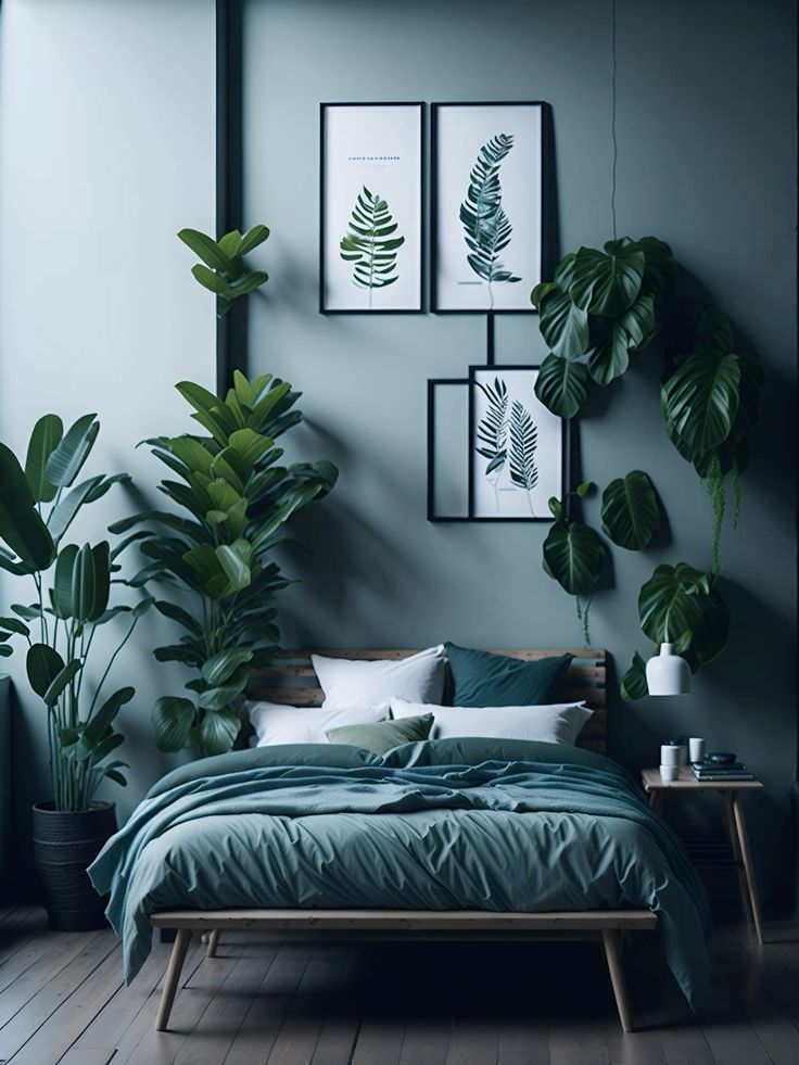
2. Muted Green: A Natural Escape
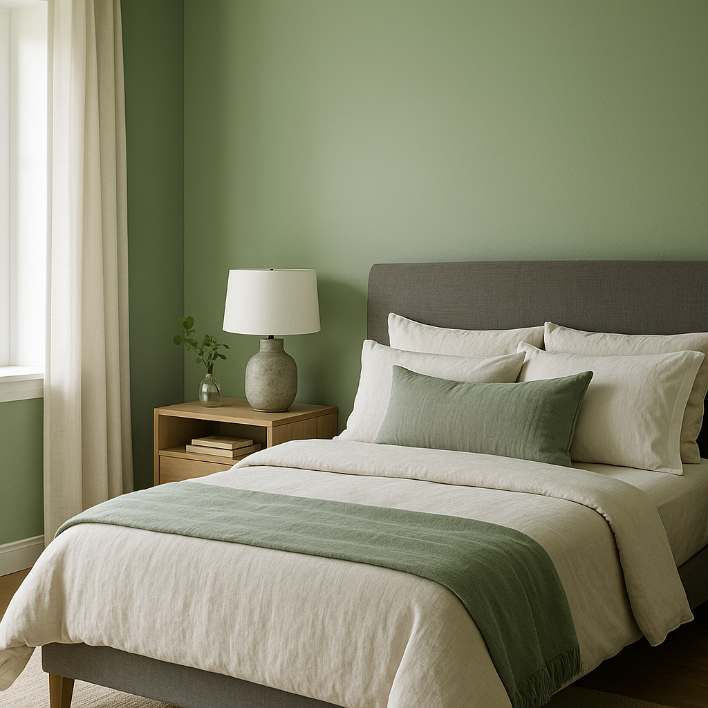
Green connects us to nature, making it one of the most inherently calming colors for the bedroom. Muted shades like sage, olive, or eucalyptus bring balance and tranquility while maintaining a sense of freshness.
How to use it: Try a sage green wall paired with creamy white trim and rattan furniture for an organic, modern aesthetic. You can also combine muted green with soft grays and warm beige for a cozy Scandinavian-inspired palette.
Best shades: Farrow & Ball’s “Green Smoke,” Behr’s “Nature’s Gift,” or Sherwin-Williams’ “Silvermist.”
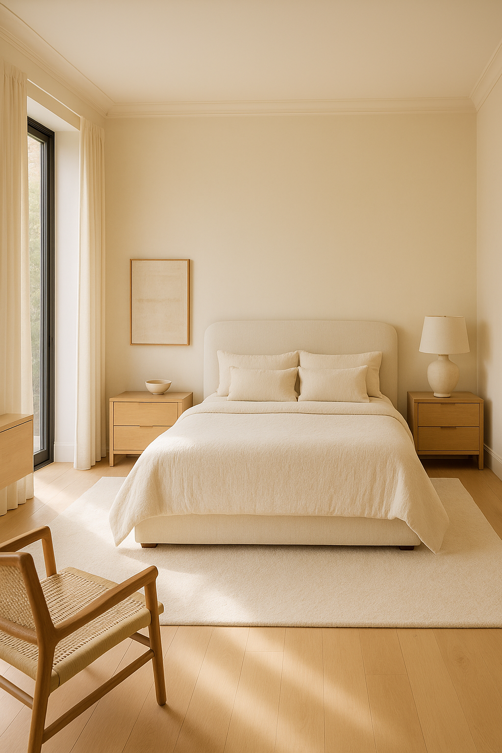
3. Warm Neutrals: Cozy and Timeless
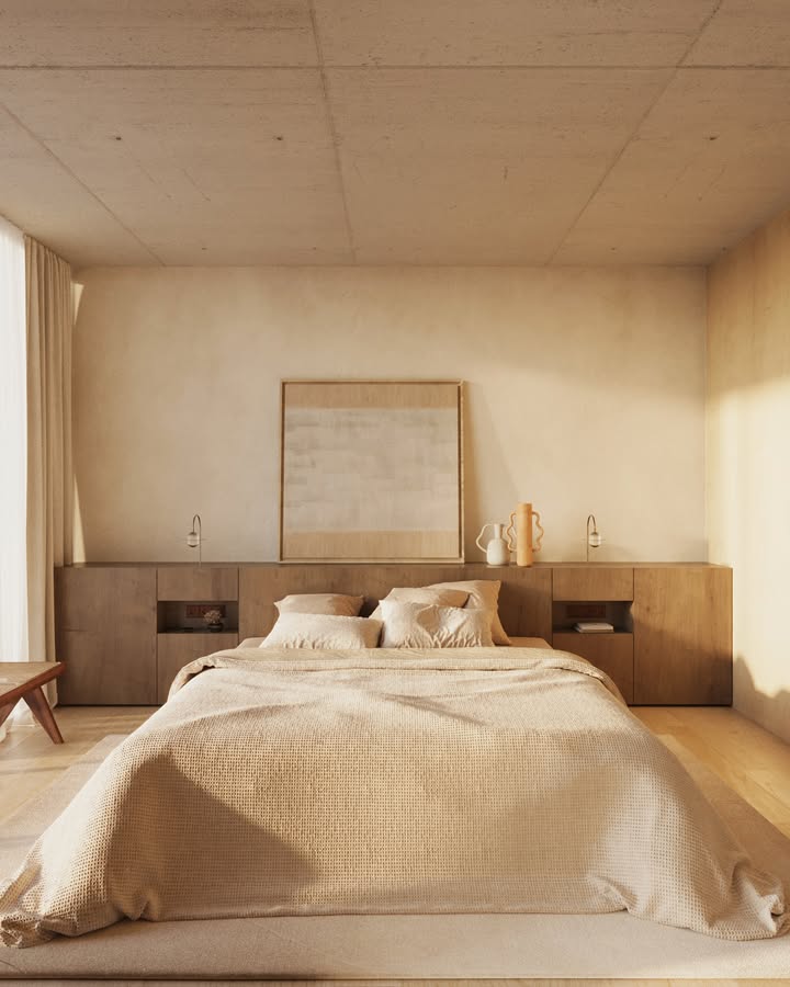
Neutral tones never go out of style—and when chosen wisely, they can create an incredibly soothing environment. Think soft taupe, warm ivory, or greige (a gray-beige hybrid). These colors reflect natural light beautifully, making your bedroom feel both calm and inviting.
How to use it: Layer various textures—linen bedding, wool throws, and jute rugs—to add depth and comfort without overwhelming the senses. A warm neutral backdrop also works well with earthy or wood accents for a grounded, minimalist look.
Best shades: Benjamin Moore’s “Edgecomb Gray,” Dunn-Edwards’ “Whisper,” or Sherwin-Williams’ “Accessible Beige.”
4. Dusty Pink and Mauve: Subtle Warmth with a Soft Touch
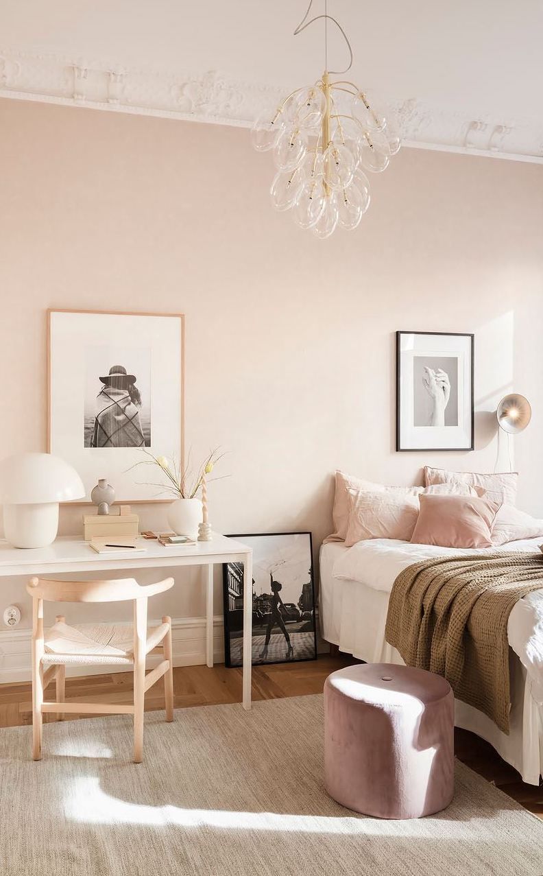
If you want to add a gentle touch of color without overpowering the room, dusty pink or muted mauve tones can be surprisingly calming. These colors create warmth and tenderness, adding emotional softness that encourages relaxation.
How to use it: Balance dusty pink walls with white or oatmeal-colored textiles to avoid an overly feminine look. Gold or matte black light fixtures can modernize the palette beautifully.
Best shades: Benjamin Moore’s “Mauve Mist,” Farrow & Ball’s “Setting Plaster,” or Behr’s “Blushing Pink.”
5. Light Gray: The Modern Neutral
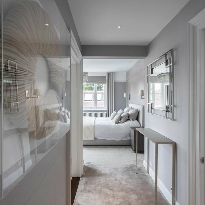
Gray may sound dull, but when done right, it creates one of the most sophisticated and peaceful bedroom palettes. A soft, warm gray with beige or lavender undertones provides the perfect backdrop for modern minimalism or luxurious simplicity.
How to use it: Pair with crisp white bedding and a textured wool blanket. Add greenery for a pop of life and warmth. Avoid overly cool grays that can feel sterile—opt for hues with a hint of warmth for that serene vibe.
Best shades: Sherwin-Williams’ “Repose Gray,” Behr’s “Silver Drop,” or Benjamin Moore’s “Gray Owl.”
6. Creamy White: Pure and Peaceful
Nothing feels as timeless and clean as a creamy white bedroom. It creates an airy, light-filled atmosphere that instantly soothes the mind. The trick is choosing the right undertone—avoid bright whites that feel harsh and instead go for warm, buttery shades.
How to use it: Add natural elements like wooden nightstands, clay vases, and cotton bedding to bring warmth and texture. Soft lighting will make creamy white walls glow beautifully at night.
Best shades: Sherwin-Williams’ “Alabaster,” Benjamin Moore’s “White Dove,” or Behr’s “Cotton Knit.”
7. Lavender and Lilac: Dreamy and Restful
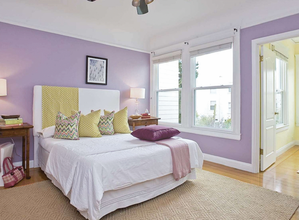
Lavender’s calming association with aromatherapy translates beautifully into color. Soft lavender or lilac walls promote peace, creativity, and emotional balance. When paired with whites and grays, the result is dreamy and modern.
How to use it: Add linen curtains and brushed gold accents for a mature, elegant look. For a more youthful space, combine lilac with blush pink or muted green accessories.
Best shades: Benjamin Moore’s “French Lilac,” Behr’s “Lunar Light,” or Valspar’s “Silverberry.”
8. Misty Taupe: The Best of Both Worlds
If you can’t decide between gray and beige, taupe might be your perfect middle ground. Misty taupe brings the grounding comfort of brown with the airy feel of gray. It’s sophisticated, understated, and incredibly versatile.
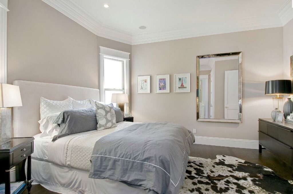
How to use it: Combine with white trim, soft blue bedding, and black accents for a modern hotel-style bedroom.
Best shades: Sherwin-Williams’ “Perfect Greige,” Behr’s “Natural Almond,” or Benjamin Moore’s “Revere Pewter.”
9. Soft Terracotta: Warm and Earthy Serenity
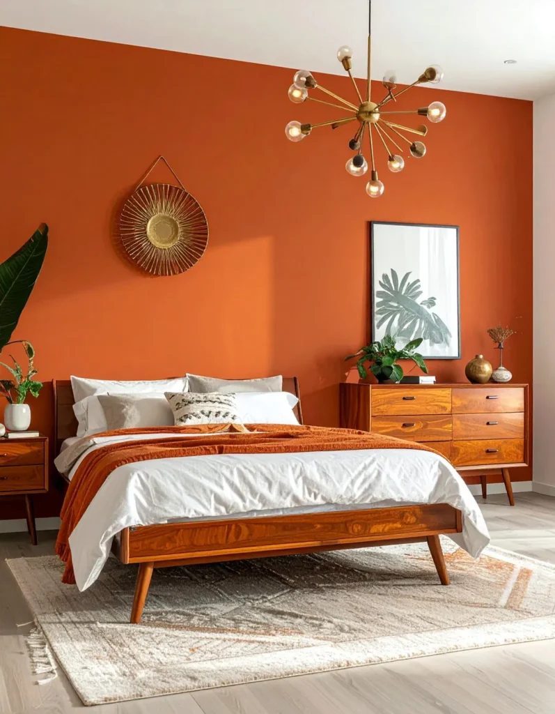
While terracotta is often seen as a bold, rustic tone, its softer versions can create a surprisingly peaceful atmosphere. Think of muted clay or peachy beige tones inspired by sunbaked earth and desert calm.
How to use it: Blend with creamy whites, sandy neutrals, and soft gray linens for a Mediterranean-inspired retreat.
Best shades: Behr’s “Adobe Sand,” Farrow & Ball’s “Dead Salmon,” or Sherwin-Williams’ “Canyon Clay.”
10. Ocean-Inspired Blue-Green: Serenity with Depth
Teal, aquamarine, or seafoam hues offer a refreshing twist on classic blue. These ocean-inspired colors evoke tranquility and emotional balance, perfect for those who want color with personality.
How to use it: Paint one accent wall in teal and keep the rest of the space neutral with whites and light woods. Add woven baskets or coral-inspired art to complete the coastal look.
Best shades: Benjamin Moore’s “Beach Glass,” Behr’s “Aqua Smoke,” or Sherwin-Williams’ “Sea Salt.”
Tips for Choosing Your Perfect Calming Shade
- Test samples at different times of day: Natural light changes color perception.
- Keep undertones in mind: Warm undertones feel cozier; cool undertones feel fresher.
- Match with your textures: Linen, wood, rattan, and cotton complement calming tones.
- Limit contrast: Avoid jarring color combinations; aim for harmony across elements.
- Consider lighting: Warm light bulbs make cool tones feel inviting, not cold.
Bringing It All Together
Creating a tranquil bedroom is about more than just picking paint—it’s about balance, texture, and light. Choose one of these calming bedroom paint colors and let it anchor your design decisions. Whether you lean toward nature-inspired greens, spa-like blues, or soft neutrals, your color palette should help you feel centered and restored every time you walk in.
In a world that’s constantly moving, your bedroom deserves to be your still point—a quiet, restorative space painted in peace.