As we look ahead to 2027, the world of interior design is embracing colors that balance timeless appeal with forward-thinking sophistication. Sherwin-Williams, a trusted leader in paint innovation, continues to shape how we experience our living spaces through carefully curated palettes that respond to evolving cultural shifts and design philosophies. The company’s Colormix Forecast program, which provides insights extending three to five years into the future, points toward a design landscape defined by emotional resonance, longevity, and meaningful storytelling .
The colors gaining prominence for 2027 reflect a world in transition—one that craves both stability and renewal. From foundational neutrals that provide calm consistency to restorative darks that offer depth and sanctuary, today’s most sought-after shades speak to our collective desire for spaces that feel authentic, comforting, and intentionally designed. Whether you’re planning a complete home renovation or simply refreshing a single room, understanding which Sherwin-Williams colors are capturing attention can help you make confident, enduring choices .
How to Choose the Right Color for Your Space
Selecting the perfect paint color goes beyond personal preference. Consider these essential factors:
Lighting Conditions: North-facing rooms receive cooler light, making warm shades like Accessible Beige or Agreeable Gray feel balanced. South-facing rooms with abundant natural light can handle cooler tones like Repose Gray or Snowbound without feeling cold.
Room Function: Bedrooms and bathrooms benefit from calming shades like Sea Salt and Upward. High-traffic living areas shine with versatile neutrals like Agreeable Gray. Dining rooms and offices can embrace deeper statement colors like Evergreen Fog or Naval.
Existing Elements: Consider your fixed elements—flooring, countertops, cabinetry, and furniture. The right paint color should complement, not compete with, these permanent features.
Color Flow: For open-concept homes, choose colors that transition smoothly from one space to another. Agreeable Gray and Repose Gray are excellent for maintaining visual continuity.
What follows are 11 of the most popular and design-forward Sherwin-Williams paint colors positioned to define interiors through 2027, along with insights into why they resonate and how to use them effectively.
1. Agreeable Gray (SW 7029)
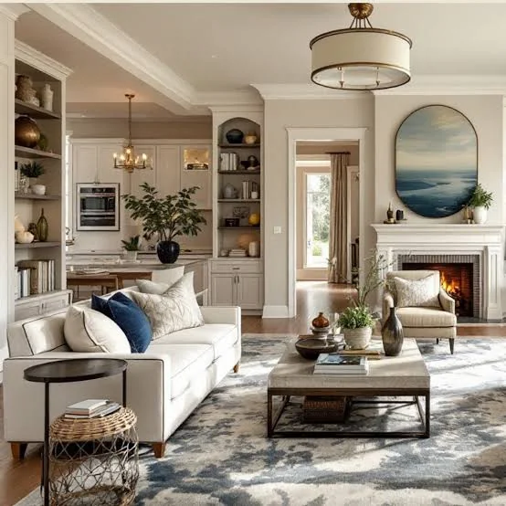
Perhaps the most versatile shade in Sherwin-Williams’ library, Agreeable Gray continues its reign as a designer favorite heading into 2027. This “greige”—a harmonious blend of gray and beige—strikes a perfect balance between warm and cool undertones, making it an ideal backdrop for virtually any space or design style .
Interior designers consistently recommend Agreeable Gray for open-concept homes because it creates visual continuity without feeling flat or repetitive. Its chameleon-like quality—appearing slightly warmer in bright light and grayer in cooler conditions—adds depth that keeps interiors interesting throughout the day .
Best uses: Living rooms, bedrooms, kitchens, and entire open floor plans. Pairs beautifully with Pure White trim .
2. Alabaster (SW 7008)
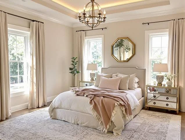
As design trends shift toward warm, human-centered interiors, Alabaster has emerged as the go-to white for homeowners seeking brightness without clinical starkness. This warm, creamy white reflects light gently, creating spaces that feel inviting and comfortable rather than sterile .
Designers value Alabaster’s softness and its ability to work harmoniously with organic materials like wood, stone, and natural textiles—a key consideration as biophilic design continues to influence 2027 trends . Unlike cooler whites that can feel harsh, Alabaster wraps rooms in warmth while still maintaining a clean, fresh appearance.
Best uses: Living rooms, bedrooms, hallways, cabinetry, and trim throughout the home.
3. Pure White (SW 7005)
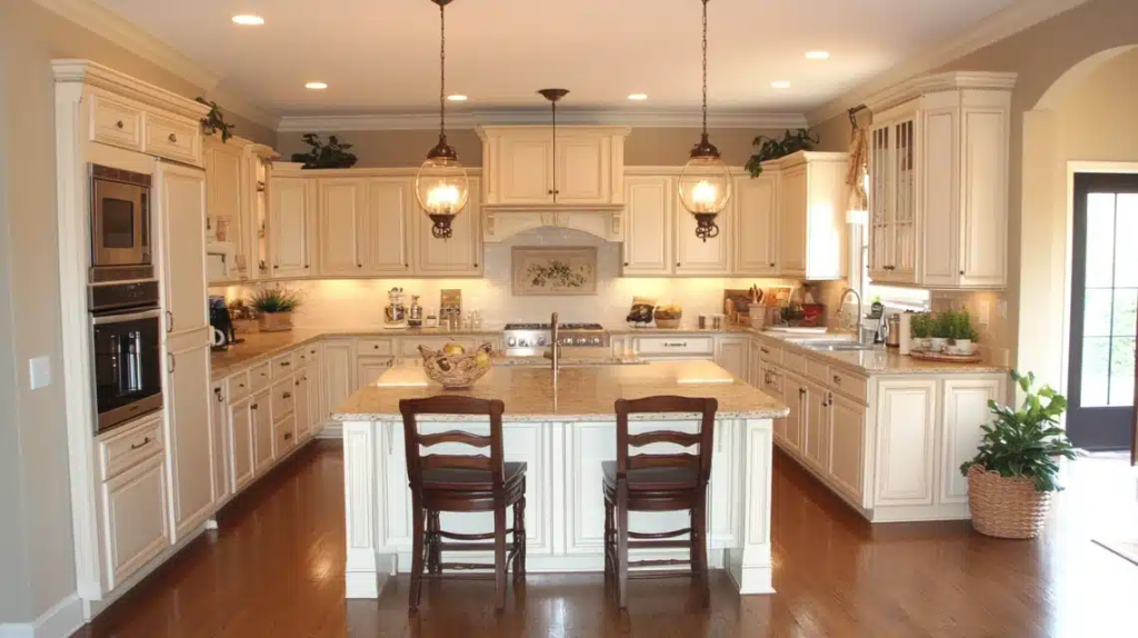
For those seeking a truly balanced white without strong undertones, Pure White remains a staple. This clean, crisp shade avoids the yellow warmth of Alabaster and the coolness of other whites, making it extraordinarily versatile .
Interior designer Erin Sander describes Pure White as “our foundation for calm and quiet,” noting that it “creates a sense of peace within a space, allowing the eye to rest” . When art, handmade pieces, or statement furniture are meant to take center stage, Pure White quietly does the heavy lifting as an unobtrusive yet inviting backdrop .
Best uses: Trim, ceilings, cabinetry, modern interiors, and as a backdrop for art and architectural details.
4. Sea Salt (SW 6204)
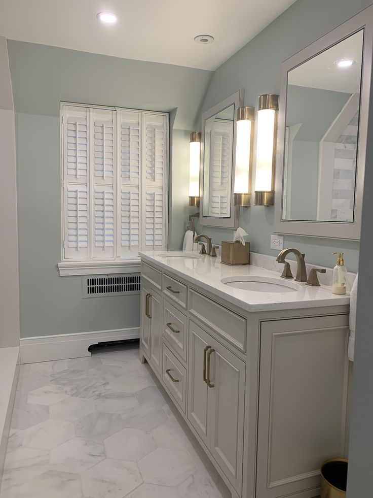
A consistent favorite for its remarkable versatility, Sea Salt is a pale blue-green with subtle gray undertones that shifts beautifully throughout the day. This chameleon quality makes it feel fresh and dynamic rather than static, adapting to changing light conditions .
Designer Krista Shugars notes that Sea Salt “nails that soft, serene vibe that subtly shifts with the light throughout the day,” anchoring rooms in a feeling that’s “soft, balanced, and timeless” . Its ability to work across decorating styles—from French Country to coastal contemporary—makes it a reliable choice for kitchens, bathrooms, and bedrooms alike .
Best uses: Kitchens, bathrooms, bedrooms, and spaces where a serene atmosphere is desired.
5. Repose Gray (SW 7015)
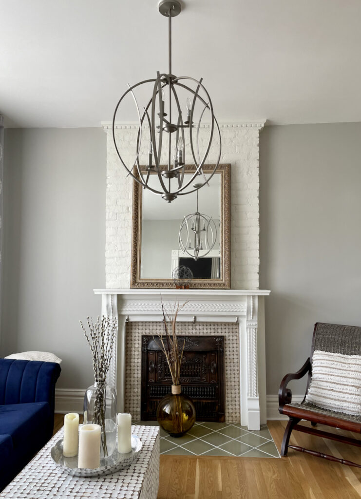
Repose Gray has earned its reputation as one of the most adaptable neutrals in Sherwin-Williams’ collection. This cooler greige responds beautifully to varied lighting conditions—appearing lighter in bright spaces and warmer in lower light—making it ideal for homes with rooms facing different directions .
Designers trust Repose Gray for its ability to support flow and cohesion throughout the home, serving as a consistent, understated foundation that allows furnishings and finishes to stand out . It works particularly well in north-facing rooms or spaces where cooler light prevails .
Best uses: Living areas, bedrooms, transitional spaces, and entire home interiors.
6. Evergreen Fog (SW 9130)
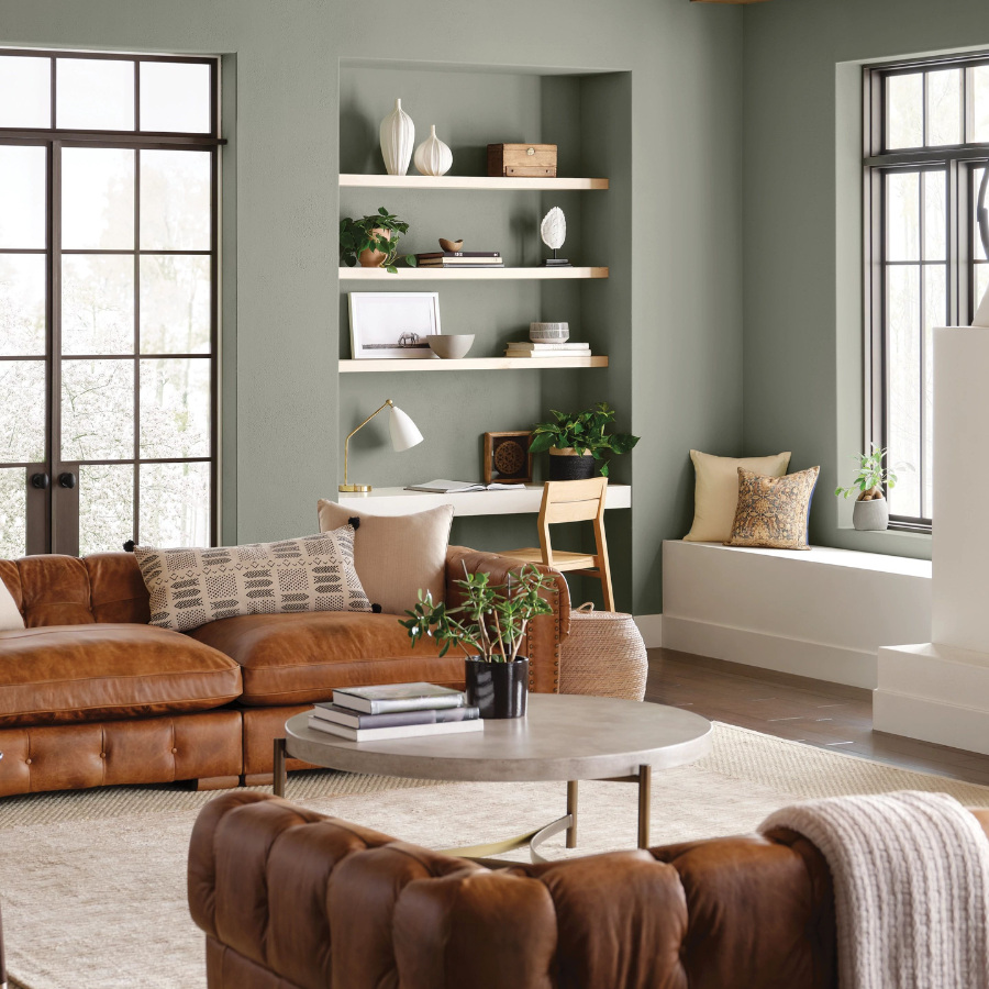
Named Sherwin-Williams’ 2022 Color of the Year, Evergreen Fog has proven its staying power through 2027. This sage green with subtle gray undertones brings the outdoors in, creating spaces that feel grounded and connected to nature .
Designer Lindsey Henzy values Evergreen Fog for striking “that rare balance between warmth and softness, feeling grounded without being too heavy,” adding that “the subtle green-gray undertone brings a sense of ease and connection to nature” . In dining spaces especially, she finds the shade encourages people to linger, creating “an inviting, collected atmosphere that feels both elevated and effortlessly comfortable” .
Best uses: Bedrooms, dining rooms, living spaces, and anywhere a calming nature-inspired palette is desired.
7. Naval (SW 6244)
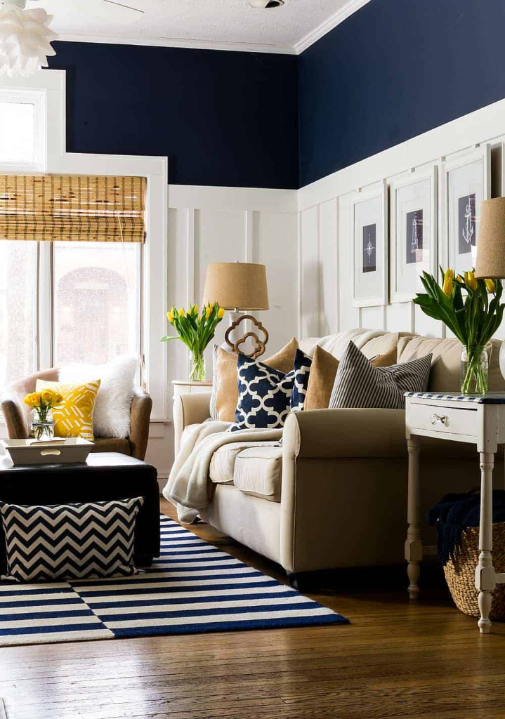
For those seeking sophistication and depth, Naval delivers with its deep navy hue. This rich blue creates a moody, elegant environment that feels both calming and luxurious, making it a top choice for accent walls, cabinetry, and statement spaces .
The trend toward “restorative darks” identified in Sherwin-Williams’ Colormix forecasts suggests that deep, saturated colors like Naval will continue gaining prominence through 2027 as homeowners embrace darker palettes for their sanctuary-like qualities . Naval’s classic appeal ensures it remains relevant across changing design cycles.
Best uses: Accent walls, kitchen cabinetry, home offices, powder rooms, and exterior doors.
8. Urbane Bronze (SW 7048)
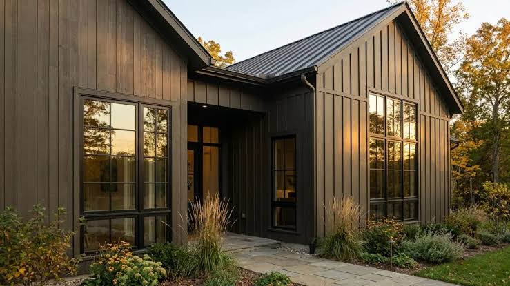
Urbane Bronze represents the perfect marriage of brown, gray, and black—an earthy neutral that radiates warmth while maintaining modern sophistication. This elegant shade works beautifully with natural materials like wood and leather, making it ideal for creating grounded, inviting spaces .
As part of the move toward deeper neutrals in 2027 palettes, Urbane Bronze offers a sophisticated alternative to stark blacks and traditional browns. Its complexity adds richness that feels both timeless and design-forward .
Best uses: Home offices, living rooms, bathrooms, exterior siding, and accent walls.
9. Accessible Beige (SW 7036)
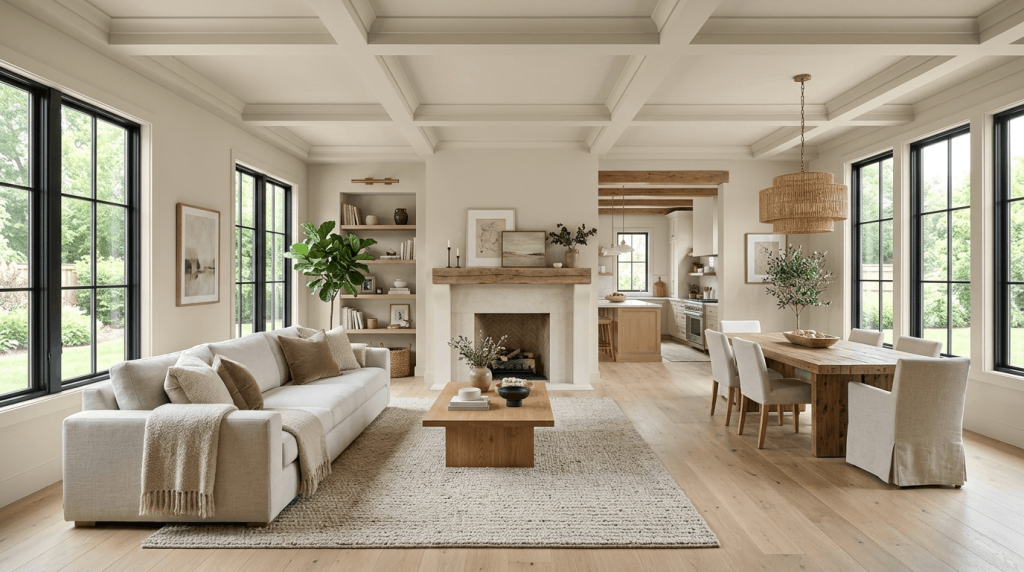
Accessible Beige continues to be a top choice for homeowners seeking warmth without overwhelming color. This soft beige with subtle gray undertones offers enough warmth to feel inviting while remaining neutral enough to work with various design schemes .
What makes Accessible Beige particularly valuable is its ability to create a sense of warmth without veering into yellow or orange territory. It serves as an excellent alternative to gray for those who find cooler neutrals too stark, yet it remains sophisticated enough for contemporary interiors .
Best uses: Living rooms, bedrooms, hallways, and as an alternative to gray throughout the home.
10. Snowbound (SW 7004)
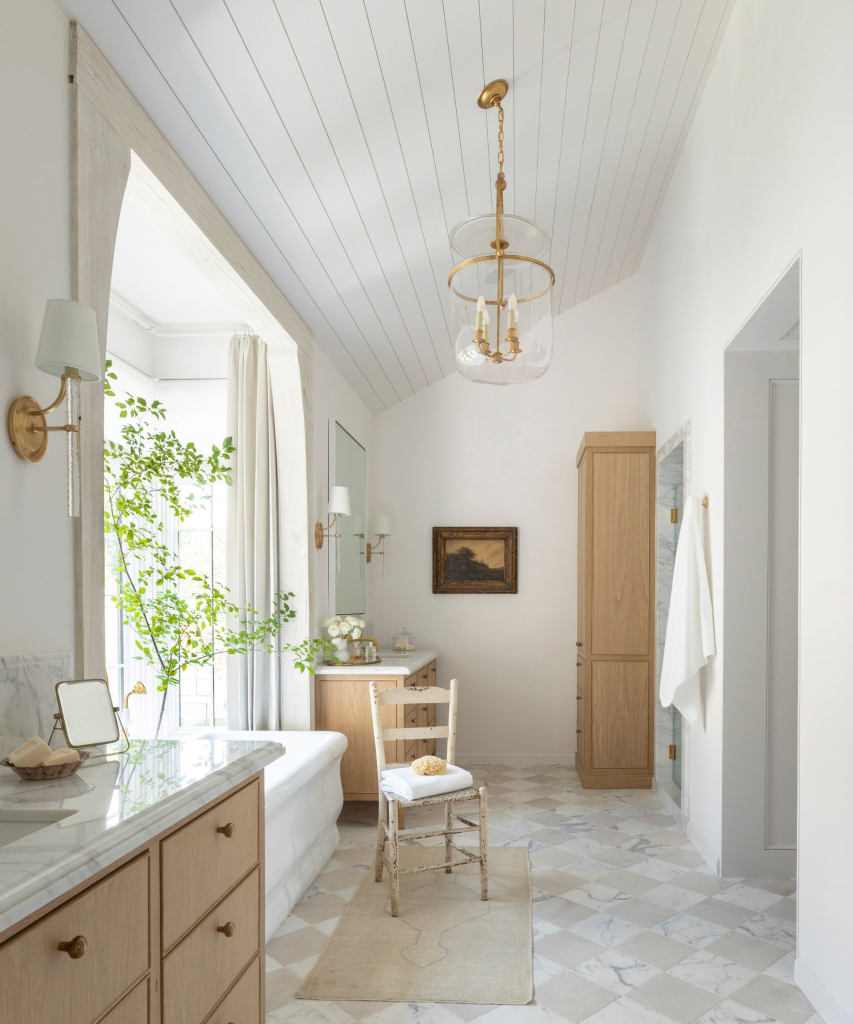
For designers working in contemporary and transitional spaces, Snowbound offers a crisp white with a subtle gray undertone that brightens rooms without feeling overly cold. This clarity makes it especially valuable in homes featuring cooler palettes and clean architectural lines .
Snowbound’s refined minimalism aligns perfectly with the design direction identified in Sherwin-Williams’ Colormix Foresight program, which emphasizes spaces that feel intentional, relevant, and meaningful . It works particularly well in modern interiors where thoughtful contrast and clean simplicity are key.
Best uses: Kitchens, bathrooms, modern living spaces, trim, and ceilings.
11. Upward (SW 6239)
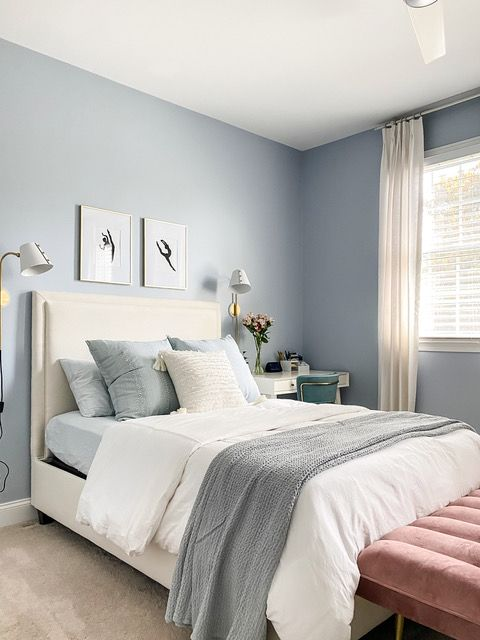
Named Sherwin-Williams’ 2025 Color of the Year, Upward represents a light and breezy blue that evokes tranquility and optimism. This soft, airy shade captures the cultural desire for renewal and positive forward momentum that characterizes the mid-2020s .
Upward’s popularity reflects broader design trends identified in color forecasts through 2027, where “cool chromatic” shades—especially those in the blue-green family—are positioned to gain significant traction . Its versatility makes it suitable for both traditional and contemporary interiors, offering a peaceful atmosphere that supports rest and relaxation.
Best uses: Living rooms, bedrooms, nurseries, and spaces where a calming, optimistic atmosphere is desired.
Color Pairing Guide for 2027
| Primary Color | Complementary Colors |
|---|---|
| Agreeable Gray | Pure White trim, Naval accents, natural wood |
| Alabaster | Urbane Bronze accents, warm woods, black hardware |
| Pure White | Snowbound contrast, Evergreen Fog accents |
| Sea Salt | Pure White trim, warm woods, brass fixtures |
| Repose Gray | Alabaster trim, Navy accents, white marble |
| Evergreen Fog | Alabaster, warm woods, brass and gold tones |
| Naval | Pure White trim, brass hardware, warm woods |
| Urbane Bronze | Alabaster, warm woods, black accents |
| Accessible Beige | Pure White, navy, warm browns |
| Snowbound | Pure White contrast, black accents, wood tones |
| Upward | Pure White, warm woods, soft whites |
Current Color Trends Shaping 2027
Biophilic Influence: Colors like Evergreen Fog and Sea Salt reflect the growing desire to connect indoor spaces with nature. These organic shades bring the calming essence of the outdoors inside.
Restorative Darks: Deep hues like Naval and Urbane Bronze are gaining popularity as homeowners seek sanctuary-like spaces. These colors create intimate, cocooning environments perfect for relaxation.
Warm Neutrals: The shift away from cool grays toward warm greiges and beiges continues. Alabaster and Accessible Beige offer the warmth consumers crave without sacrificing neutrality.
Timeless Over Trendy: Today’s homeowners prioritize colors with staying power. The most popular shades are those that transcend fleeting design fads and remain beautiful for years.
Intentional Contrast: Mixing light and dark shades within a single space adds visual interest. Pairing Snowbound trim with Naval walls or Urbane Bronze accents creates sophisticated depth.
Pro Tips for Testing Paint Colors
1. Sample First: Always test colors on your actual walls before committing. Paint at least a 2×2 foot section and observe at different times of day.
2. Observe Lighting Changes: Check your samples in morning, midday, and evening light. Artificial lighting also affects how colors appear.
3. Use Primer: A quality primer ensures true color representation, especially when transitioning from dark to light shades.
4. Consider the Finish: Flat and matte finishes hide imperfections but are less durable. Eggshell and satin offer washability with subtle sheen. Semi-gloss works best for trim and high-moisture areas.
5. Paint Large Swatches: Small swatches can be deceiving. Paint larger sections or use peel-and-stick samples to better visualize the final result.
Frequently Asked Questions
Q: What is the most versatile Sherwin-Williams color for an entire house?
A: Agreeable Gray (SW 7029) remains the top choice for whole-home color due to its perfect balance of warm and cool undertones.
Q: Which white is best for trim?
A: Pure White (SW 7005) is the most popular trim color because it complements virtually any wall color without adding unwanted undertones.
Q: What color makes a room look bigger?
A: Lighter shades like Alabaster, Pure White, and Snowbound reflect more light, making spaces feel more open and airy.
Q: Are dark colors still trending for 2027?
A: Yes, restorative darks like Naval and Urbane Bronze are increasingly popular for accent walls, cabinetry, and exterior applications.
Q: How do I choose between Agreeable Gray and Repose Gray?
A: Choose Agreeable Gray for warmer spaces with southern light. Choose Repose Gray for cooler spaces or if you prefer a slightly grayer tone.
Conclusion
As we approach 2027, the most popular Sherwin-Williams paint colors reflect a design landscape shaped by both permanence and transition . The colors gaining prominence—from versatile greiges like Agreeable Gray and Repose Gray to restorative darks like Naval and Urbane Bronze—demonstrate a collective desire for spaces that feel authentic, grounding, and emotionally resonant .
What distinguishes these 11 shades is their remarkable versatility and longevity. They represent colors that perform well across different lighting conditions, complement a wide range of design styles, and possess enough depth and nuance to remain interesting over time. Whether you’re drawn to the warm embrace of Alabaster, the serene balance of Sea Salt, or the sophisticated depth of Urbane Bronze, these colors offer a foundation for creating spaces that feel both timely and timeless.
As Sherwin-Williams’ color experts continue to develop their Colormix Forecast program, one thing remains clear: the most successful interiors will be those that tell meaningful stories, connect with nature, and provide genuine comfort . The colors we choose for our walls are more than decoration—they’re a reflection of how we want to live, feel, and connect with the spaces we call home.
