Designing a guest bedroom is a unique interior design challenge. Unlike your primary bedroom, which is a reflection of your personal taste, a guest room needs to be a neutral sanctuary that appeals to a wide range of preferences. It should feel like a high-end hotel suite but with the warmth of a family home.
The single most impactful element you can choose is the color palette. Color dictates the mood, the perceived size of the room, and the quality of sleep your guests will get. Do you want the room to feel energizing for early risers, or soothing for jet-lagged travelers? Do you have a small space that needs to feel larger, or a large room that needs to feel cozy?
The Psychology of Color in Guest Rooms
Before diving into specific palettes, it is crucial to understand how color affects your guests psychologically. You are not just painting a room; you are curating an emotional experience.
- Cool Colors (Blues, Greens, Lavenders): These shades lower heart rates and blood pressure, promoting deep, restorative sleep. They are ideal for guests who are traveling long distances or dealing with jet lag.
- Warm Colors (Yellows, Terracottas, Warm Taupes): These colors are sociable and inviting. They encourage conversation and make guests feel immediately hugged and welcomed. However, they should be used in muted tones in a bedroom, as bright versions can be overstimulating.
- Neutrals (Whites, Greiges, Beiges): These provide a “reset” button for the mind. They offer a sense of cleanliness and order, which is psychologically reassuring for guests who might feel like they are intruding on your personal space.
- Dark Colors (Navy, Charcoal, Forest Green): These create a “cocooning” effect. Psychologically, they make a large room feel more intimate and secure, which is excellent for guests who are anxious or need total darkness to sleep well.
In this guide, we’ve curated 15 diverse color ideas, ranging from timeless neutrals to bold statements, ensuring there is a perfect shade for every style of home and every type of guest.
15 Well-Structured Color Ideas
Here are 15 color schemes, complete with the “mood” they create, the “best for” situation, and a “design tip” to help you execute them perfectly.
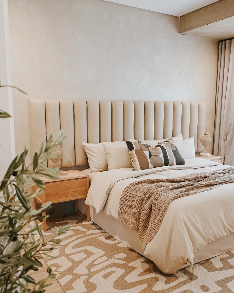
1. The Classic Whiteout (White & Cream)
- The Mood: Clean, airy, and timeless. It acts as a blank canvas, allowing guests to feel like they aren’t imposing on a highly personal space.
- Best For: Small rooms or spaces with little natural light.
- Design Tip: Avoid a sterile look by layering textures. Use a chunky knit throw, linen bedding, and a jute rug to add warmth to the white.
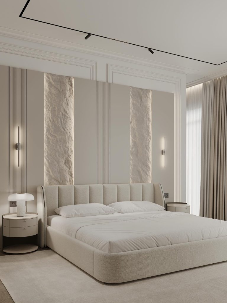
2. Warm Greige (Gray + Beige)
- The Mood: Sophisticated and cozy. This hybrid color offers the modern coolness of gray with the earthiness of beige, making it incredibly versatile.
- Best For: Homes with contemporary or transitional decor.
- Design Tip: Pair this with black iron hardware and warm wood tones (like walnut) to add depth and prevent the room from feeling flat.
3. Sea Salt Green (Sage Green)
- The Mood: Calming and restorative. Green is associated with nature and tranquility, which helps guests unwind after a long journey.
- Best For: Creating a spa-like atmosphere.
- Design Tip: Use high-gloss paint for the trim and matte paint for the walls. This contrast adds a modern, high-end feel to the natural color.
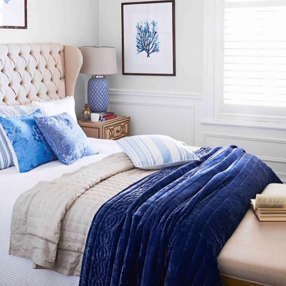
4. Dusty Blue & Sand
- The Mood: Relaxed coastal vibe. This combo brings the beach indoors without looking like a tourist gift shop.
- Best For: Rooms that serve as a vacation getaway.
- Design Tip: Use the dusty blue on the walls and reserve the sand color for the upholstery and linens. Add a woven rattan mirror for a final bohemian touch.
5. Charcoal & Blush Pink
- The Mood: Dramatic yet soft. The dark charcoal anchors the room, while the blush pink (used sparingly) adds a touch of warmth and romance.
- Best For: A modern guest room with high ceilings.
- Design Tip: Paint an accent wall behind the bed charcoal. Use blush pink for the decorative pillows and a single piece of artwork.
6. Lavender & Lilac
- The Mood: Uplifting and gentle. Purple hues are often overlooked but are perfect for promoting restful sleep.
- Best For: Rooms intended for older guests or those who appreciate a vintage, feminine aesthetic.
- Design Tip: Keep it modern by choosing a muted, grey-toned lavender rather than a bright, vibrant purple. Pair with brushed gold accents.
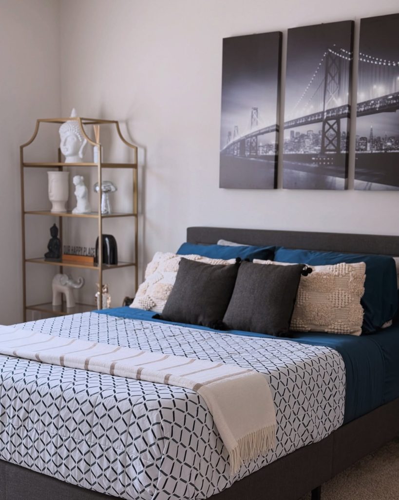
7. Midnight Navy
- The Mood: Bold, cocooning, and “moody.” Navy creates a sense of security, perfect for a deep sleep.
- Best For: Large guest rooms that feel too cavernous.
- Design Tip: Balance the dark walls with crisp white bedding and brass lamps. The light reflects off the brass, preventing the navy from feeling like a cave.
8. Olive & Ochre
- The Mood: Earthy and global. This is a sophisticated, worldly palette that feels very “Grand Millennial.”
- Best For: Homes with a mid-century modern aesthetic.
- Design Tip: Use olive for the main walls and ochre (mustard yellow) for an accent throw blanket or a velvet headboard. Add a large fern for a pop of life.
9. Pure Black & White
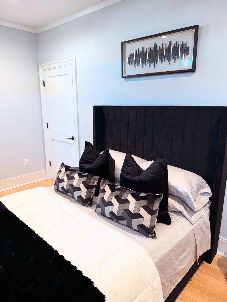
- The Mood: Graphic, crisp, and editorial. This high-contrast look is undeniably chic.
- Best For: A city apartment or an urban guest suite.
- Design Tip: Don’t do 50/50. Use 80% white and 20% black (e.g., white walls, black window frames, black and white photography on the walls) to keep it elegant rather than harsh.
10. Buttery Yellow
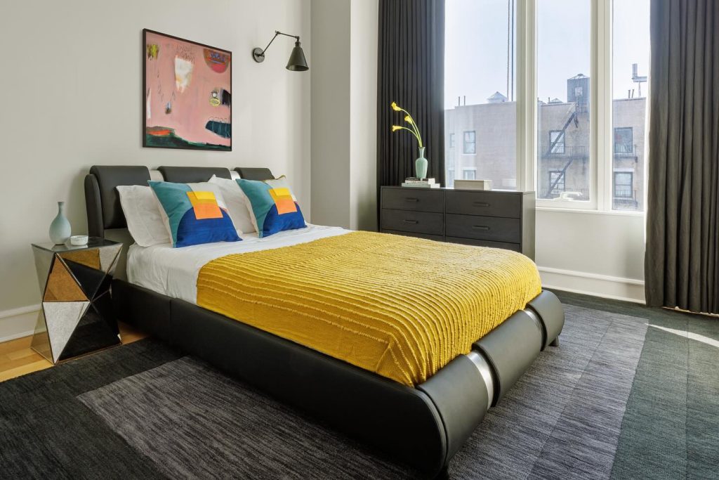
- The Mood: Cheerful and welcoming. Yellow wakes up the senses and says “good morning” in a happy way.
- Best For: Rooms that don’t get a lot of direct sunlight.
- Design Tip: Use a very pale, creamy butter yellow rather than a bright sunflower. Pair it with light gray to tone down the energy.
11. Warm Terracotta
- The Mood: Southwestern and grounded. This earthy clay color feels both rustic and incredibly chic.
- Best For: Adding warmth to a cold, modern space.
- Design Tip: Keep the ceiling white and the floor dark to ground the terracotta. Use linen textures to emphasize the organic nature of the color.
12. Greige with a Pop of Coral
- The Mood: Neutral foundation with an unexpected twist.
- Best For: The “safe” choice for homeowners who want to add a touch of personality.
- Design Tip: Keep the walls a soft greige. Add the coral solely through accessories—a lampshade, a vase, or a single chair. It’s easy to change if your taste evolves.
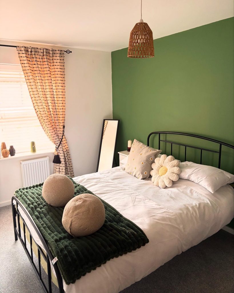
13. Moody Forest Green
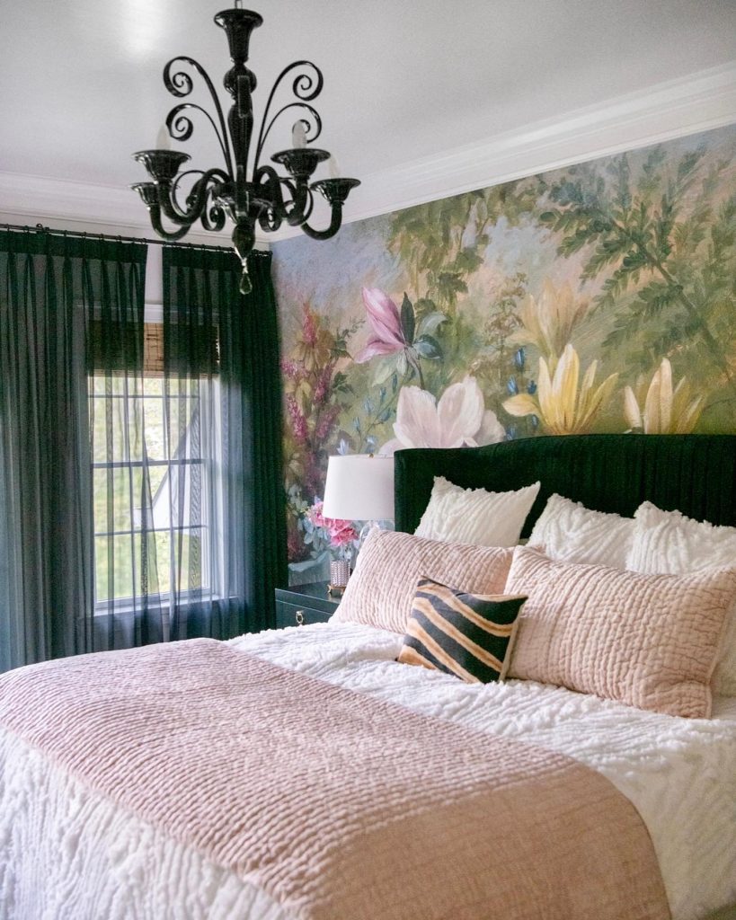
- The Mood: Rustic, rich, and luxurious. It feels like a cabin in the woods, even in the suburbs.
- Best For: Guest rooms with a lot of natural wood elements.
- Design Tip: Paint the walls and the ceiling the same dark green for a truly immersive “jewel box” feel. Offset it with bright white sheets.
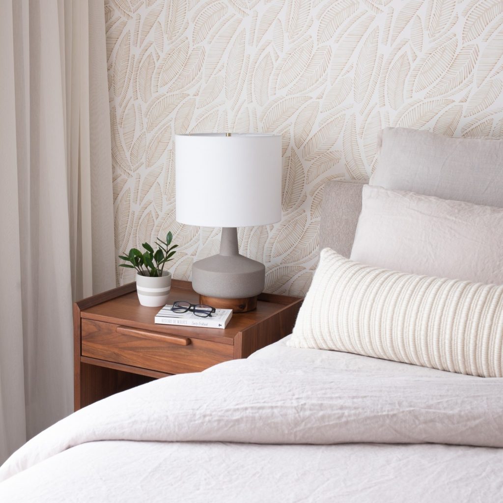
14. Warm Taupe
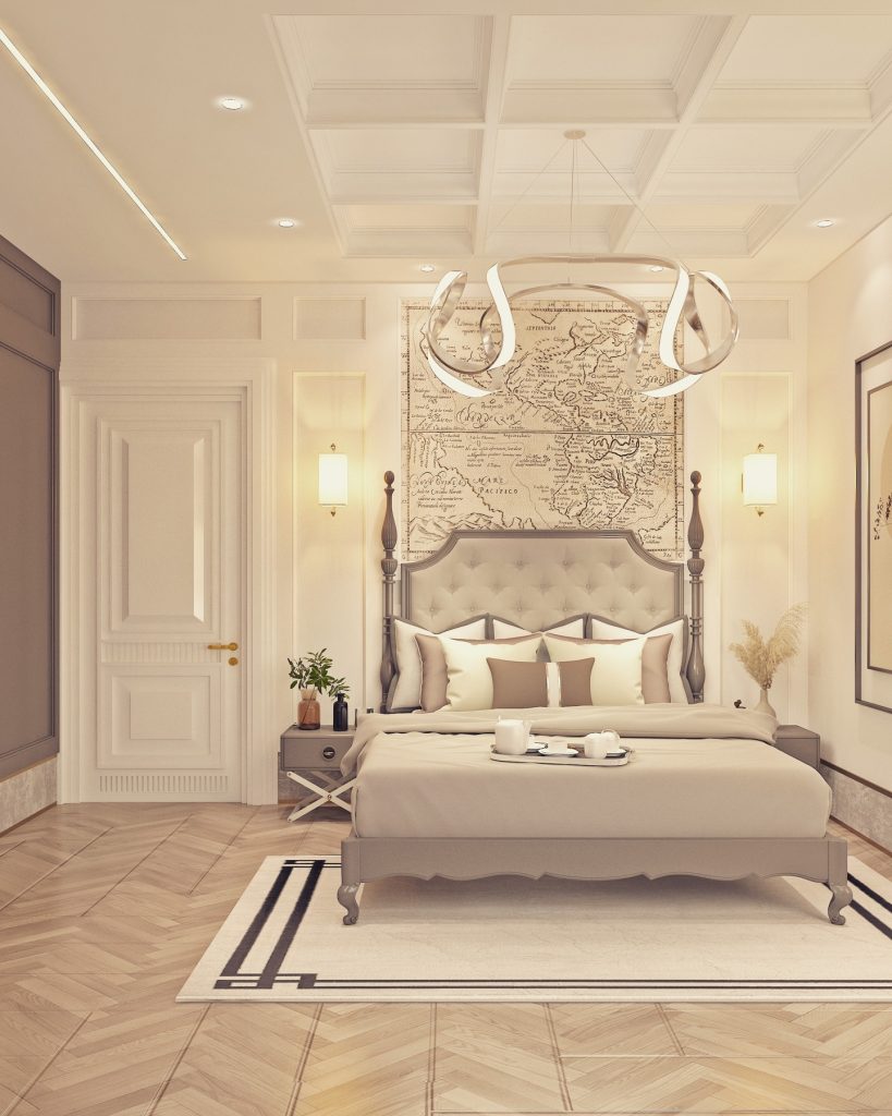
- The Mood: Understated elegance. It is richer than beige and warmer than gray.
- Best For: Traditional homes or rooms that need to transition seamlessly into the rest of the house.
- Design Tip: Layer different shades of taupe—a darker one for the rug, a medium one for the walls, and a lighter one for the drapes—to create a monochromatic, high-end look.
15. Sky Blue
- The Mood: Open, breathable, and serene. It mimics the sky, making the room feel larger.
- Best For: Small guest rooms or spaces with low ceilings.
- Design Tip: Paint the ceiling a shade lighter than the walls to draw the eye upward. Add crisp white trim to frame the color perfectly.
Factors to Consider Before Choosing a Color
Selecting a color isn’t just about what looks pretty on a paint swatch. To ensure your guests have a five-star experience, consider these practical factors before you buy a single paint can.
Room Size and Natural Light
Light colors make small rooms feel expansive and airy, while dark colors can make cavernous rooms feel cozy and intimate. Always test your paint swatches on the wall at different times of the day. A color that looks perfect at noon might feel cold and lifeless under evening lamplight.
The Flow of Your Home
While a guest room should feel distinct, it shouldn’t feel like it belongs to a different house. Consider the colors visible from the guest room hallway or adjacent bathroom. Your palette should complement, not clash with, the rest of your home’s aesthetic.
The Demographics of Your Guests
Are you hosting elderly parents who prefer soft, traditional tones? Are you accommodating young nieces and nephews who might appreciate a fun, bright accent? If your guests vary widely, stick to versatile neutrals and add personality through easily changeable accessories like pillows and throws.
Durability and Maintenance
Guest rooms often sit empty for weeks and then get used heavily for a few days. Opt for paint finishes that are washable, such as eggshell or satin, rather than flat matte. This allows you to wipe away scuffs and marks easily between visits.
Existing Furniture and Flooring
Your color choice must work harmoniously with the fixed elements already in the room. A warm wood floor pairs beautifully with sage green or warm taupe, while a gray floor complements dusty blue or charcoal. Never choose a wall color in isolation—always hold it next to your carpet, headboard, and curtains.
Common Mistakes to Avoid
Even with the perfect color selected, it is easy to fall into common traps. Here are the pitfalls to watch out for when designing your guest bedroom.
Going Too Trendy
That neon pink or ultra-dark charcoal might look amazing on Instagram, but will your 70-year-old mother-in-law feel comfortable sleeping in it? Stick to timeless bases and save the trends for accessories you can swap out in a year.
Forgetting the Ceiling
The ceiling is often referred to as the “fifth wall,” yet it is frequently ignored. Leaving it stark white while painting the walls a deep color can make the room feel chopped in half. Consider painting the ceiling a lighter shade of your wall color for a cohesive, expensive look.
Overlooking Undertones
Not all grays are created equal. Some have blue undertones, while others have green or purple undertones. If your carpet has warm yellow undertones, pairing it with a cool gray wall will create a jarring clash. Always check the undertone of both your paint and your fixed elements in natural light.
Skimping on Sample Size
Never choose a color based on a tiny 2-inch swatch. Paint a large 2-foot by 2-foot square on your wall and observe it at sunrise, noon, and sunset. A color that looks perfect at 10 AM can look completely different at 8 PM under artificial lighting.
Ignoring the Finishes
A color’s appearance changes drastically depending on the sheen. Flat paint hides imperfections but is hard to clean. Satin and eggshell are more durable and reflect light, making colors appear slightly lighter and brighter. Choose wisely based on your wall condition and cleaning needs.
How to Tie the Room Together (Beyond Paint)
Color is the foundation, but accessories complete the story. Here is how to build upon your chosen palette to create a truly welcoming guest experience.
Bedding and Textiles
Your bed should be the star of the show. Layer your primary color with complementary shades through sheets, duvets, and throws. If your walls are a bold navy, use crisp white bedding. If your walls are neutral, feel free to introduce a patterned quilt that incorporates several accent colors. Texture is just as important as color—mix linen, cotton, velvet, and wool for depth.
Window Treatments
Curtains and blinds should frame your color scheme, not fight it. In a small room with light walls, choose curtains in a slightly darker shade to add depth. In a dark room, sheer white curtains will prevent the space from feeling like a dungeon. Ensure your window treatments also serve a practical purpose—blackout lining is a non-negotiable for guests who want to sleep in.
Artwork and Wall Decor
Art is where you can introduce unexpected accent colors without committing to them permanently. A large abstract painting can pull together your dusty blue walls with hints of gold and sand. Mirrors are also essential—they bounce light around the room and make the space feel larger, especially when placed opposite a window.
Lighting Layers
Color looks different under different lights. Invest in three layers of lighting: ambient (overhead), task (bedside lamps for reading), and accent (a floor lamp or wall sconce). Choose warm-toned bulbs (2700K) rather than cool daylight bulbs to ensure your cozy warm colors look their best.
The Finishing Touches
Never underestimate the power of fresh flowers, a stack of books, a carafe of water, and a cozy throw at the foot of the bed. These small details show your guests you care. Additionally, ensure the room has a full-length mirror, a luggage rack, and empty drawer space—these practical considerations make the color scheme feel even more luxurious.
Conclusion
Designing the perfect guest bedroom is an act of hospitality. By carefully selecting a color palette that balances psychology, practicality, and personal style, you transform a spare room into a sanctuary where your visitors can rest, recharge, and feel genuinely welcome.
Remember that the best guest rooms are not about making a bold statement for the sake of it; they are about making your guests feel safe, comfortable, and cared for. Whether you choose the timeless elegance of warm taupe, the serene tranquility of sage green, or the cocooning drama of midnight navy, the goal is always the same—to create a space that says, “Stay as long as you like.”
So, grab your paint swatches, consider your guests’ needs, and start transforming that spare room today. Your visitors will thank you with a great night’s sleep—and they will definitely be back for another visit.