The single-color kitchen has had its moment. In 2026, designers are embracing contrast—layering earthy lows with airy highs to create spaces that feel alive: grounded yet open, bold yet calm.
Below, we break down the 15 most compelling two-tone combinations of the year, from subtle tonal shifts to confident statements.
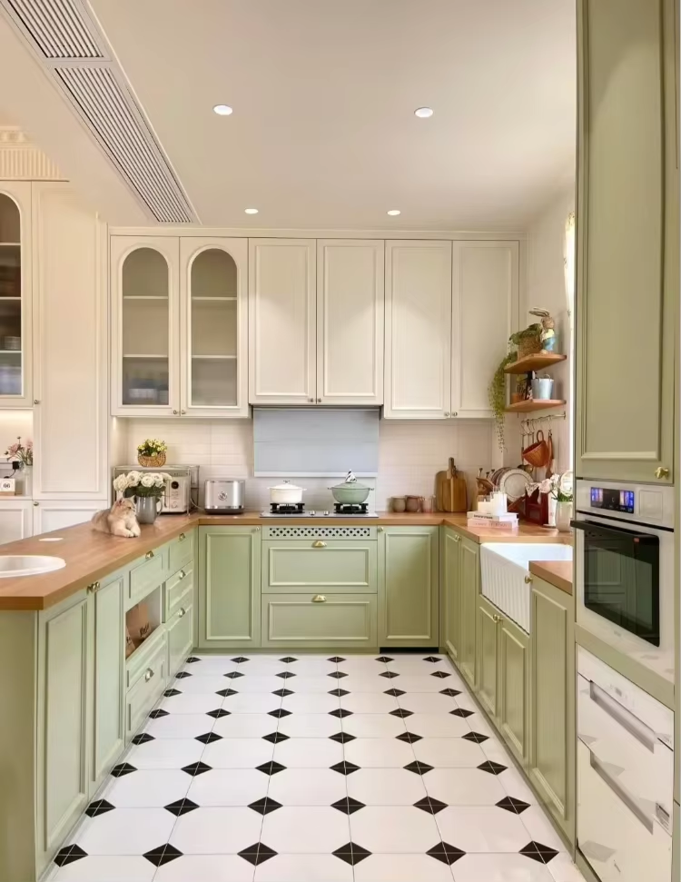
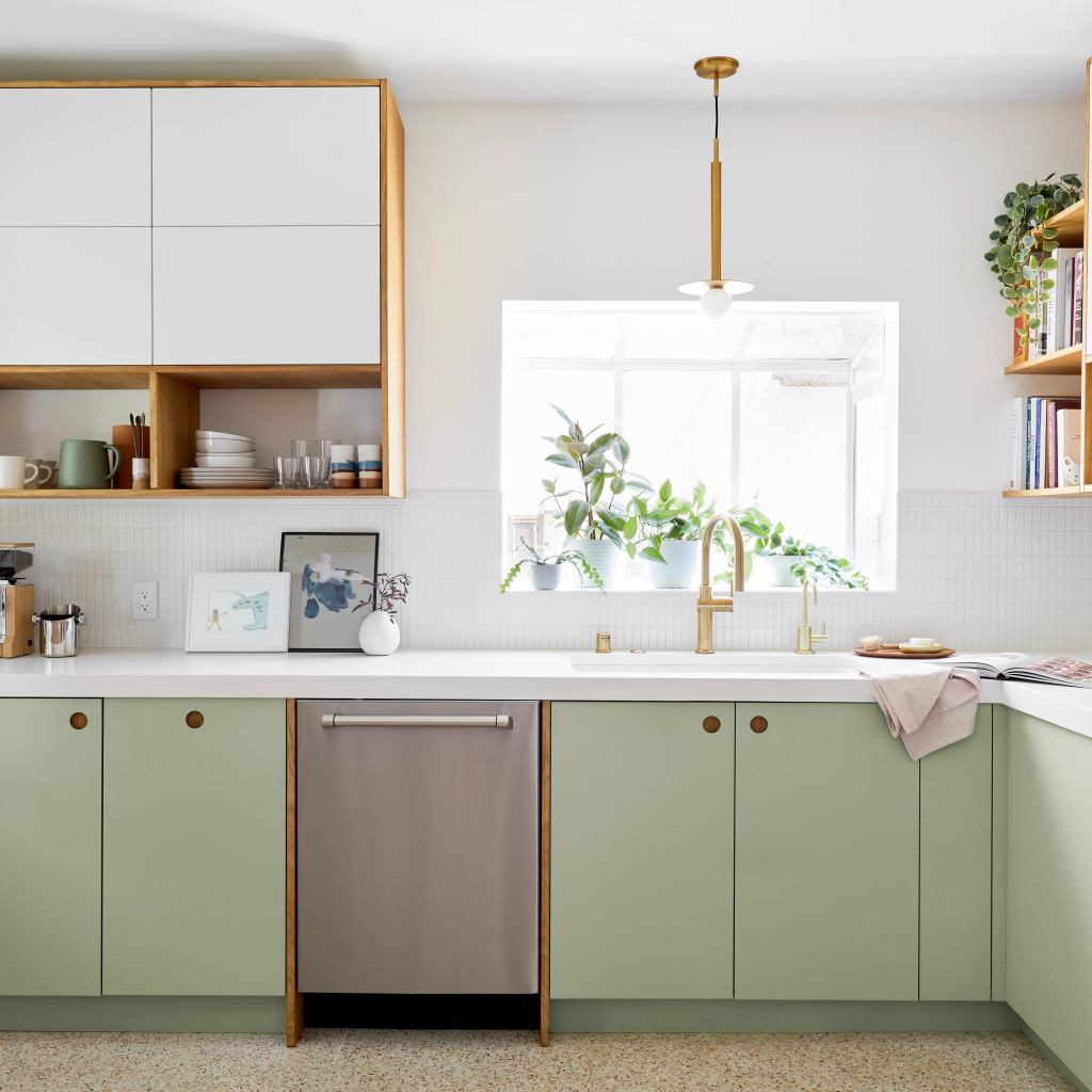
01 Sage Lower + Warm White Upper
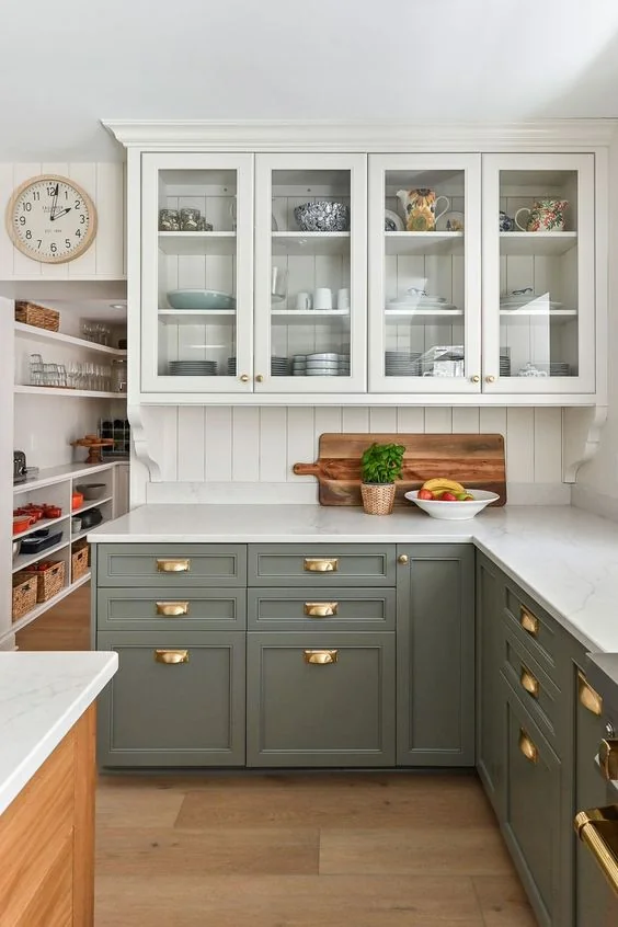
Sage green · Warm white
The defining two-tone of 2026. Sage lowers anchor the room with organic depth, while warm white uppers lift the ceiling and keep the palette breathable. A matte finish on both prevents the look from feeling overly polished.
Tip: Pair with unlacquered brass hardware for instant warmth.
02 Terracotta Island + Linen Perimeter
Terracotta · Linen
Reserve the bolder tone for the island—it becomes a focal point without overwhelming the room. Terracotta is 2026’s answer to navy: earthy, warm, and instantly grounding. Linen on the perimeter cabinets keeps the surrounding kitchen soft and cohesive.
Tip: Concrete or honed limestone countertops bridge the two tones beautifully.
03 Slate Blue Lower + Off-White
Slate blue · Off-white
Cooler than navy and richer than powder blue, slate brings a sophisticated coastal-meets-Nordic feel. Off-white uppers prevent it from feeling heavy. This combination works especially well in north-facing kitchens, where natural light is softer.
Tip: Brushed nickel or pewter hardware keeps the palette from veering nautical.
04 Charcoal Base + Natural Oak Open Shelving
Charcoal · Natural oak
Swap upper cabinets for open oak shelving above a charcoal base. The contrast is dramatic, but the warmth of raw timber stops the kitchen from reading cold. One of the most-pinned combinations heading into 2026, this pairing suits both contemporary and transitional kitchens.
Tip: Keep shelving loose and curated—overcrowding kills the effect.
05 Dusty Olive Lower + Cream Shaker Upper
Dusty olive · Cream
Dusty olive is a more restrained cousin of sage—less grey, more yellow-green. Paired with cream shaker uppers, it creates a kitchen that feels grown‑up without being austere. Think Tuscan farmhouse filtered through a Scandinavian lens.
Tip: Aged brass or hand‑forged iron pulls complete the look.
Bold Moves for Confident Kitchens
06 Forest Green Full Height + Raw Walnut Island
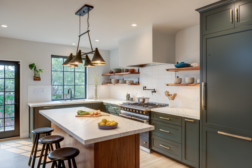
Forest green · Walnut
Go full‑height forest green on the perimeter for maximum drama, then use a raw walnut island as the textural counterpoint. The wood’s warmth prevents the green from dominating while positioning the island as the room’s centrepiece. Best suited to larger kitchens with strong natural light.
Tip: A matte black Dekton or granite top on the island finishes the palette.
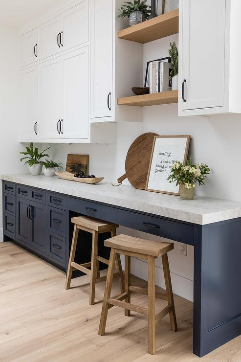
07 Midnight Blue Upper + Pale Greige Lower
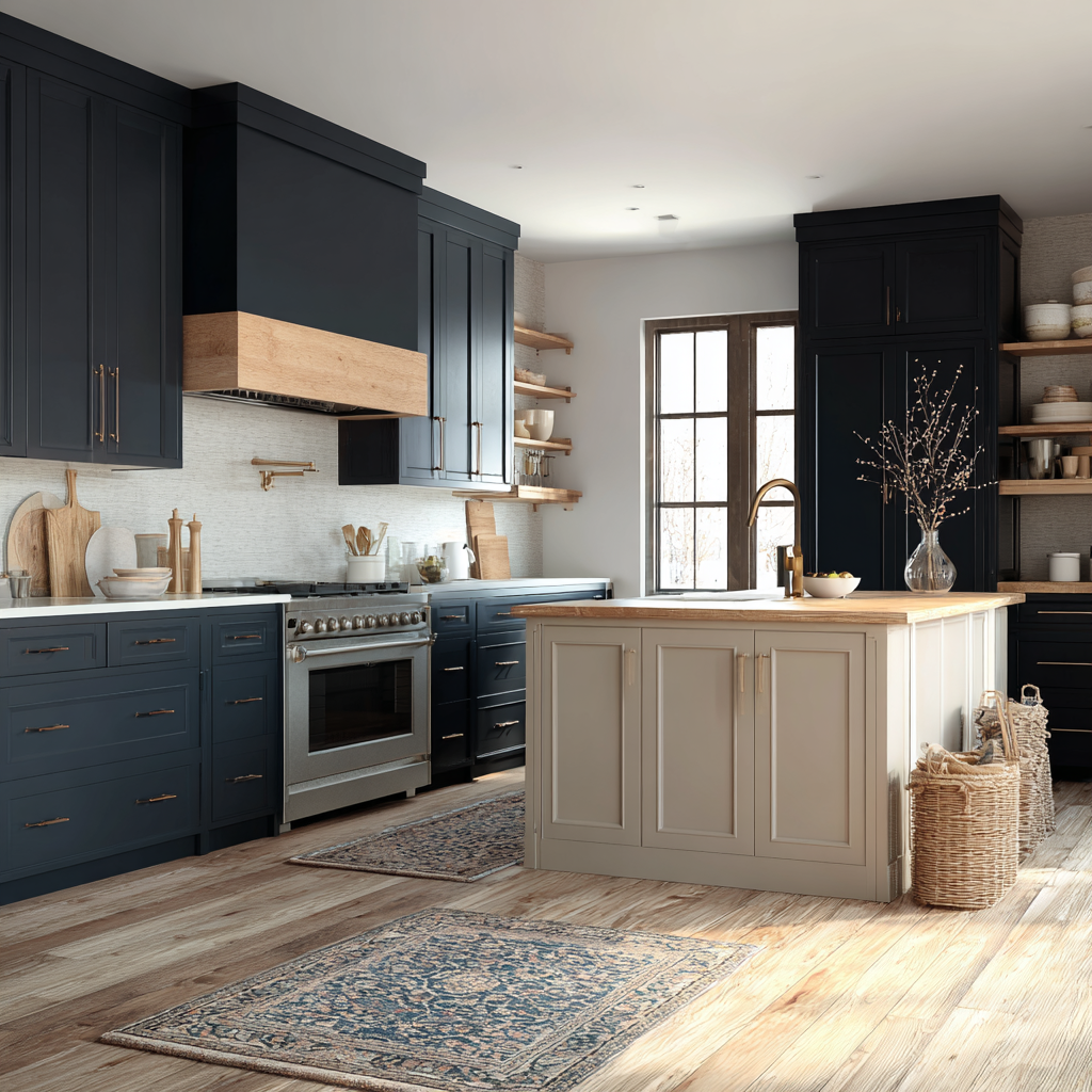
Midnight blue · Pale greige
The inversion of the classic formula—bold uppers, neutral lowers—is having a moment in 2026. Midnight blue uppers create the illusion of a slightly lower ceiling in the best possible way: intimate and cocooning. Greige lowers keep the space grounded and practical.
Tip: A white or pale grey countertop provides essential breathing room between the two tones.
08 Burgundy Lower + Stone White Upper
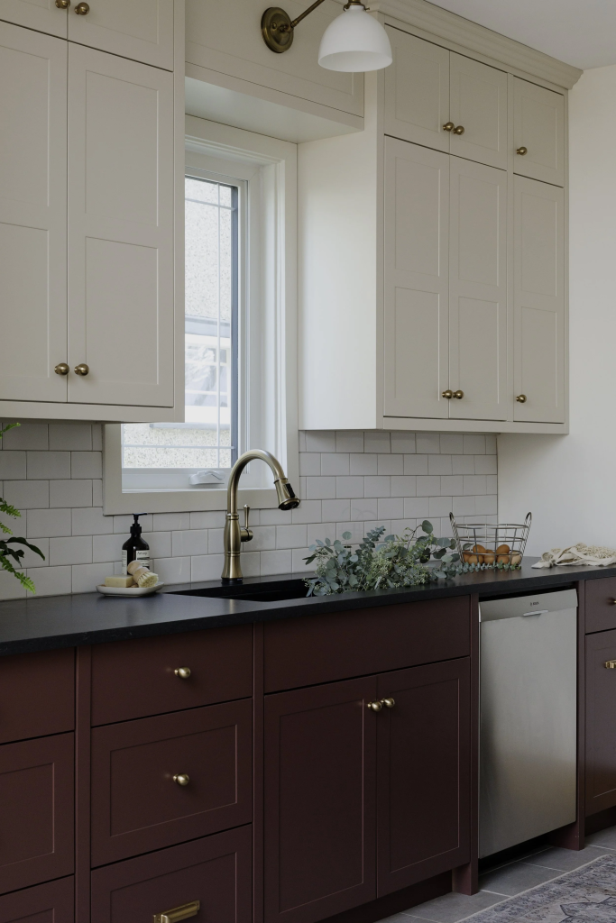
Burgundy · Stone white
Burgundy is one of 2026’s breakout kitchen tones. Rich and moody on the lowers, it reads as a sophisticated alternative to terracotta. Stone white uppers ensure the kitchen stays fresh and doesn’t tip into dark territory. A statement palette for those who want their kitchen to feel like a room, not just a workspace.
Tip: Gold or antique brass hardware amplifies burgundy’s richness.
09 Warm Taupe Lower + Concrete Grey Upper
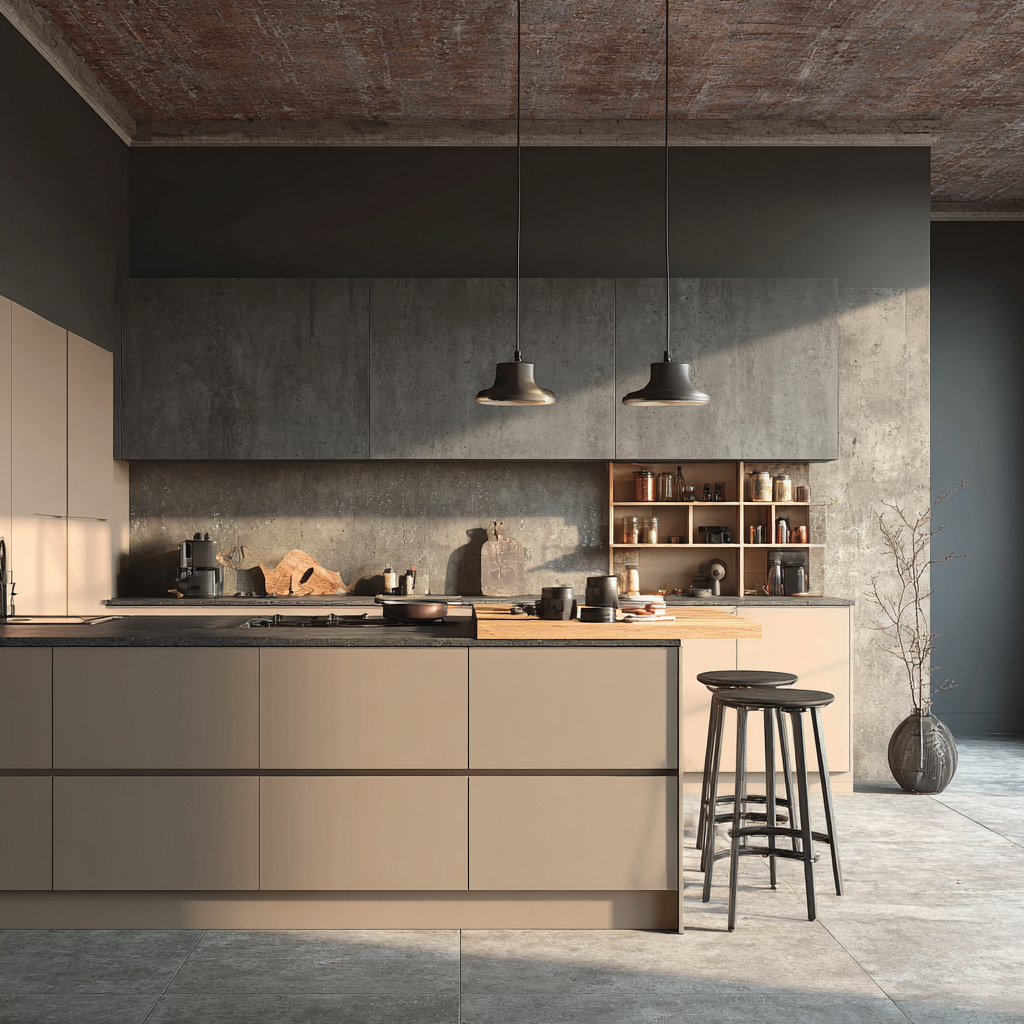
Warm taupe · Concrete grey
A tonal two‑tone rather than a contrasting one—subtle, layered, and deeply sophisticated. Warm taupe lowers and cool concrete uppers create tension through temperature rather than hue. The result is a kitchen that looks effortlessly designed rather than deliberately coordinated.
Tip: Flat‑front slab doors best emphasise the tonal shift; shaker detailing dilutes it.
10 Biscuit Lower + Deep Teal Upper
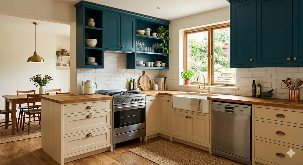
Biscuit · Deep teal
An unexpected reversal: the warm neutral on the bottom, the dramatic colour overhead. Deep teal uppers act like a canopy, wrapping the kitchen in colour from above while the biscuit lowers stay easy and light. Works especially well in kitchens with high ceilings, where the uppers might otherwise feel lost.
Tip: Line the interior of teal cabinets with natural timber veneer for a lovely surprise when opened.
Understated Approaches with Lasting Appeal
11 Chalk White Upper + Soft Black Lower
Chalk white · Soft black
The monochrome two‑tone—clean, graphic, timeless. Soft black (never a blue‑black or cool charcoal) paired with chalky white feels contemporary in 2026 without being sterile. The trick is texture: a slight sheen on the uppers and a dead‑flat finish on the lowers separates the tones without a hard line.
Tip: Aged brass hardware warms the high‑contrast palette without softening its edge.
12 Pale Pistachio Lower + True White Lacquer Upper
Pale pistachio · True white
Fresh, optimistic, and light as morning—pistachio lowers bring just enough colour to feel intentional, while white lacquer uppers keep the kitchen bright and uncomplicated. This combination suits family kitchens that need to feel cheerful without sacrificing polish.
Tip: Rattan or wicker pendants soften the lacquer sheen and complete a relaxed aesthetic.
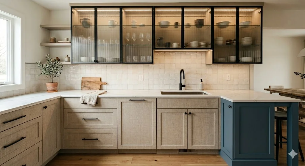
13 Mushroom Lower + Fluted Glass Upper Fronts
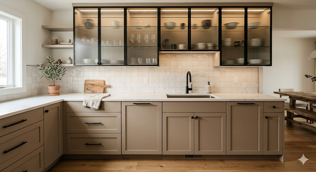
Mushroom · Fluted glass
This isn’t strictly a colour two‑tone—it’s a material one. Solid mushroom lowers paired with fluted or reeded glass fronts on the uppers creates a visual variation more dynamic than a simple hue swap. The glass adds translucency and texture; the mushroom tones below provide warmth and privacy where storage needs it.
Tip: Interior cabinet lighting transforms this combination after dark.
14 Dried Rose Lower + Putty Upper
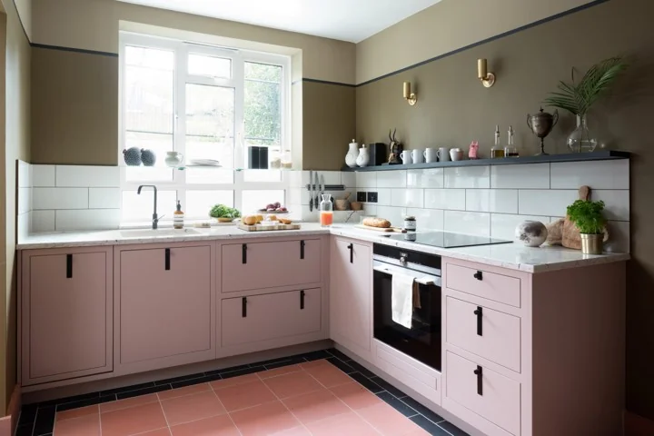
Dried rose · Putty
Pink in the kitchen has matured. Dried rose—a terracotta‑adjacent blush—avoids the sweetness of bubble‑gum pinks and leans into something more mineral and grown‑up. Paired with putty uppers, the result is a warm, earthy palette that feels modern without being cold.
Tip: An earthy zellige tile backsplash in cream or sand ties both tones together.
15 Raw Linen Lower + Storm Blue Peninsula
Raw linen · Storm blue
Apply the two‑tone horizontally rather than vertically: raw linen on all standard cabinetry, with a peninsula or breakfast bar in storm blue. The effect is of a bespoke furniture piece set within the kitchen, not built into it—a 2026 approach that makes kitchens feel less like fitted rooms and more like curated spaces.
Tip: Using a different countertop material on the peninsula (butcher block vs. stone, for example) doubles the differentiation.
The Takeaway
The throughline in 2026’s two‑tone kitchen movement is intentionality over drama. The most compelling combinations aren’t the loudest—they’re the ones where every decision, from the undertone of a white to the finish of a hardware pull, has been made with care.
Whether you’re renovating a full kitchen or simply refreshing cabinet paint, the two‑tone approach offers a way to add depth and character that a single colour simply can’t. Start with what grounds you—the lower cabinets—then build the palette upward from there.