Designers are calling time on cold, sterile, and overly trendy bathrooms. The new mandate? Warmth, texture, and a genuine sense of sanctuary. Here’s what to skip — and the timeless alternatives to embrace instead.
7 trends covered · Expert-backed · 2026
Planning a bathroom refresh this year? Before you start pinning inspiration, take note: a quiet but decisive reset is underway in the world of interior design. The looks that defined the last decade — think stark white boxes, cool grays, and high-gloss surfaces — are being gently retired. The overarching shift is clear: bathrooms in 2026 are moving away from cold, high-contrast spaces and toward rooms that feel warm, grounded, and genuinely restful. Think less clinical hotel lobby, more private forest spa.
This isn’t just about aesthetics; it’s about function, psychology, and longevity. Designers are prioritizing how a space makes you feel over how it performs in a glossy magazine spread. Here are the seven trends that are officially on their way out — and what’s earning a permanent spot in their place.
01. Skip This: All-White Everything
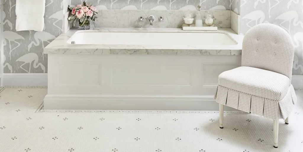
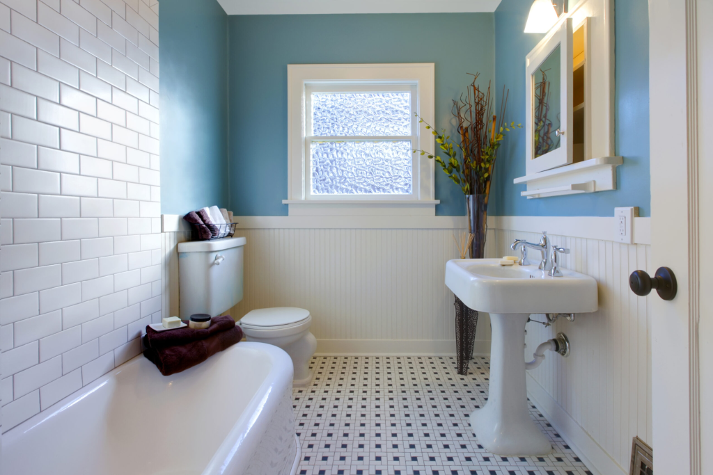
Once the gold standard of “clean and timeless,” the all-white bathroom has tipped from serene into sterile. Designers say head-to-toe white now reads less like a luxury retreat and more like a hospital ward. The problem isn’t white itself — a white ceiling or a white tub can still work beautifully — but the absence of any counterpoint. Without warmth, texture, or a single contrasting element to anchor the space, white surfaces amplify coldness, highlight every water spot, and create a faintly anxiety-inducing environment.
Why It’s Out: Psychologically, all-white spaces can feel unforgiving and exposed rather than relaxing. They also show every bit of grime, lint, and toothpaste splatter, making them surprisingly high-maintenance.
Skip: White on white on white — tiles, grout, walls, fixtures, towels all matching without a single moment of relief.
Instead:
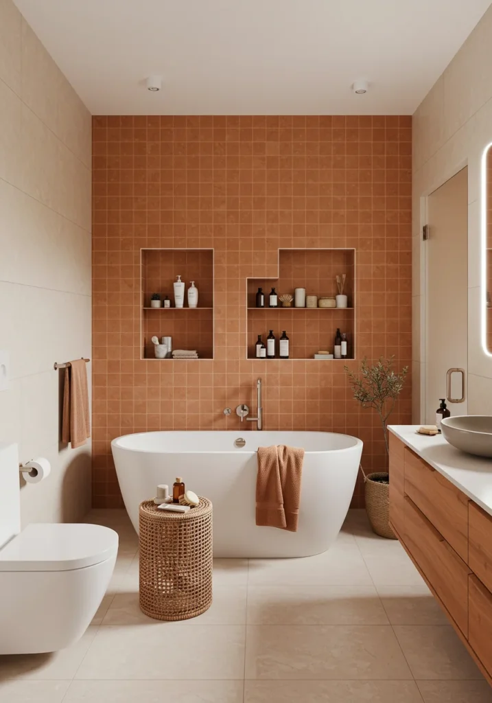
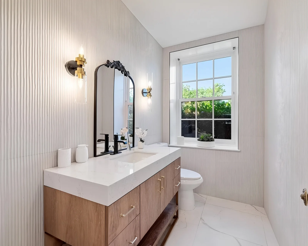
Warm earth tones — clay, sand, warm taupe, and terracotta — paired with natural stone. Think of the colors of a dried riverbed or a sun-baked canyon. These hues absorb light rather than reflecting it harshly, creating an immediate sense of enclosure and calm. Use white as an accent (e.g., a white stone vessel sink against a clay tile wall) rather than the star.
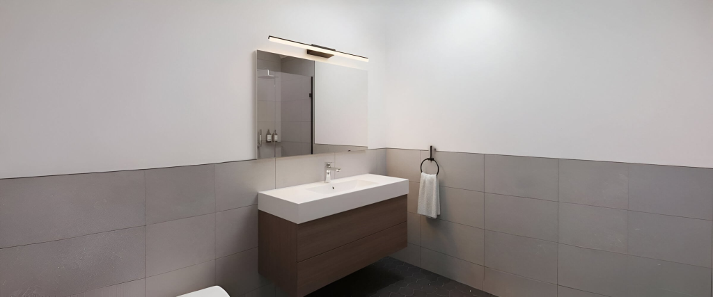
02. Skip This: Millennial Gray & Cold-Toned Schemes
The gray-and-white bathroom had a long run — nearly a decade — but its time is officially up. Designers describe it as flat, one-dimensional, and emotionally cold. The problem isn’t gray itself (a charcoal vanity can be stunning), but the specific way it was applied: cool-toned, low-contrast, and devoid of texture. This particular palette creates a kind of visual static — a depth that exists nowhere. It’s the aesthetic equivalent of an overcast Tuesday in February.
*”One bathroom trend I hope not to encounter in 2026 is the cold gray-and-white bathroom that was very popular the last 10 years. It makes everything seem really flat and one-dimensional.”*
— Craig Gritzen, Curated Style Collective
Why It’s Out: Beyond aesthetics, cool grays can actually make skin tones look sallow and tired — hardly ideal for a room where you start and end your day. The trend also became a builder-grade default, stripping it of any design intention.
Skip: Cool gray walls, bright white trim, white fixtures, and chrome taps — the ubiquitous “flipper special” combination.
Instead:
Warm greiges (a gray-beige hybrid), soft sage, deep olive, and mushroom tones. Pair these with aged brass or unlacquered bronze hardware for instant grounded warmth. If you still love gray, pivot to “warm grays” with brown or green undertones (look for names like “Pigeon” or “Taupe Gray”). The shift is subtle but transformative.
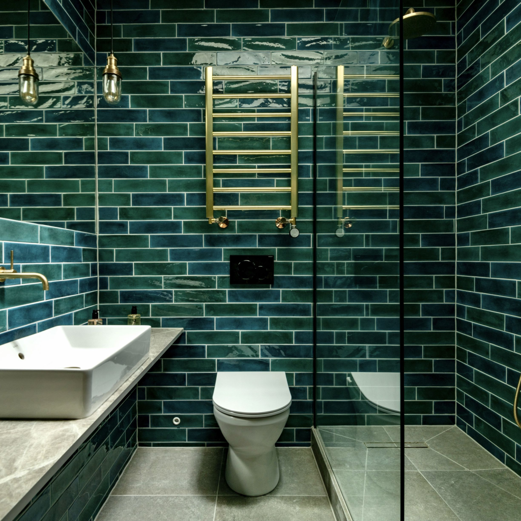
03. Skip This: Glossy Tiles Across Every Surface
Head-to-toe high-gloss tiles were a go-to for making small bathrooms feel bigger and brighter — a trick borrowed from commercial design. But in 2026, the look has worn out its welcome. Beyond the glaring practical issue (glossy floors become dangerously slippery when wet, creating a genuine safety hazard), the reflective surfaces create visual noise rather than calm. Every reflection, every glare, every light source bouncing off six different planes adds up to a space that feels frenetic.
Why It’s Out: A bathroom should lower your cortisol, not raise it. Gloss overload also shows every water droplet, fingerprint, and soap scum, requiring constant wiping to maintain its intended look. It’s a high-maintenance aesthetic that delivers low comfort.
Skip: High-gloss porcelain or ceramic tiles on floors, walls, and ceiling — reflective overload.
Instead:
Matte or eggshell finishes for large surfaces. For texture, consider zellige tiles (handmade Moroccan clay tiles with subtle, irregular glazes that catch light gently) or any handmade tile with natural variation. These surfaces breathe — they absorb light softly, hide water spots, and add the kind of organic, imperfect beauty that feels instantly more soothing. For floors, look for matte finishes with a slight grip (DCOF rating of .42 or higher for wet areas).
04. Skip This: Harsh Single-Source Lighting
A single overhead fixture or a builder-grade vanity bar mounted directly above the mirror has been a bathroom staple — and a design dead end. Harsh, unflattering, and impossible to use for tasks like applying makeup or shaving, this lighting creates deep shadows under eyes and chin. It also makes winding down in the evening nearly impossible, as a single bright overhead fixture has no dimming capability and no warmth.
Why It’s Out: Lighting is the single most undervalued element in bathroom design. Poor lighting can make an expensive renovation feel cheap and unwelcoming. Designers now treat lighting with the same layered complexity as a living room.
Skip: One central ceiling fixture or a single bar light above the mirror — flat, unforgiving, and shadow-creating.
Instead: Layered lighting working in concert:
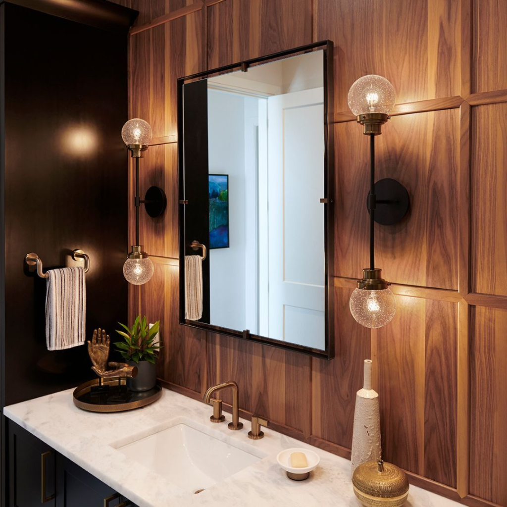
- Ambient: Dimmable ceiling lights (recessed or a flush-mount fixture on a dimmer) for overall illumination.
- Task: Sconces mounted at eye-level on either side of the mirror (or a single horizontal bar above the mirror, aimed downward). This eliminates shadows.
- Accent: Warm, low-wattage lighting (under a floating vanity, inside a niche, or a small plug-in sconce near the tub) to create a gentle evening glow.
Aim for bulbs with a color temperature of 2700K–3000K (warm white) — never the cold 4000K–5000K commonly found in builder-grade fixtures.
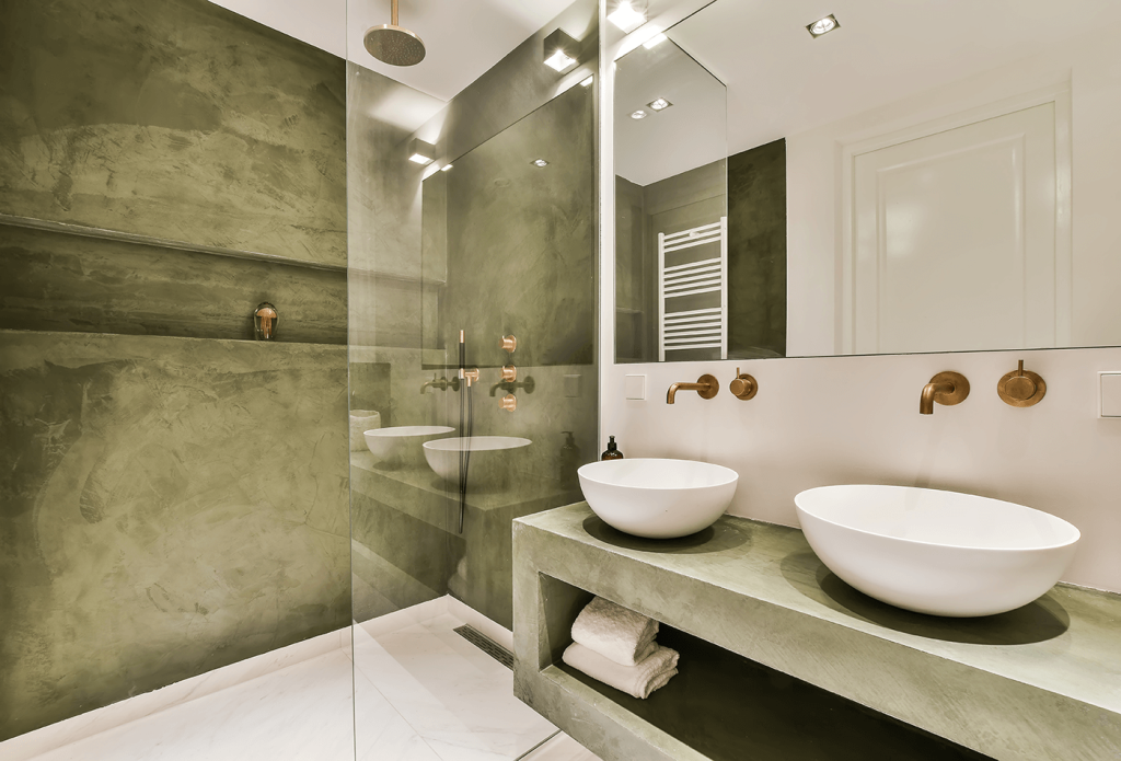
05. Skip This: Chrome Hardware Everywhere
Chrome had a long reign as the default finish for taps, towel rails, and shower fittings. It was affordable, durable, and matched everything. But paired with all-white or cool-gray schemes, it now reads as dated — the hardware equivalent of “builder basic” or a mid-tier hotel bathroom. It’s not that chrome is inherently wrong (it can look sharp in an industrial or Art Deco context), but it has been so overused in predictable, low-contrast combinations that it has lost all sense of intention.
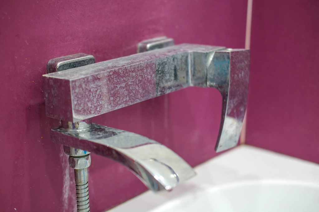
Why It’s Out: Chrome reflects its surroundings. In a cold, white, or gray bathroom, it just adds more cold, shiny surface. It also lacks the ability to patina or develop character over time — it looks exactly the same in year one as it does in year ten, for better or worse.
Skip: Shiny chrome on every single fixture — taps, towel bars, shower head, drain cover, and accessories all matching without exception.
Instead: Finishes that add warmth and evolve with age:
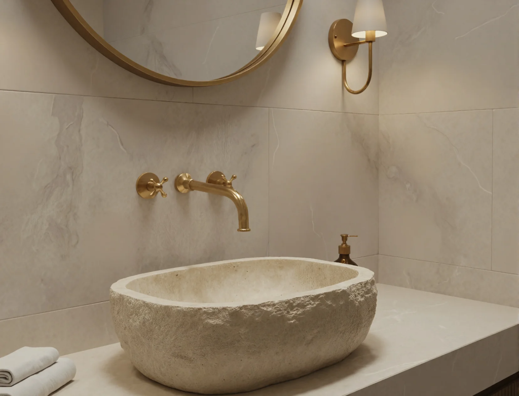
- Brushed brass or brushed nickel: Soft, warm, and low-maintenance (no visible fingerprints). Brushed brass has golden undertones; brushed nickel is slightly cooler but still warmer than chrome.
- Unlacquered brass: Starts bright and golden but darkens and develops a rich, natural patina over time — the antithesis of sterile newness.
- Matte black: Still viable, but use sparingly as an accent against warm wood or stone, not against stark white.
The key is intention — choose one finish and commit, or deliberately mix two complementary finishes (e.g., unlacquered brass on taps, matte black on towel bars) for a collected, curated look.
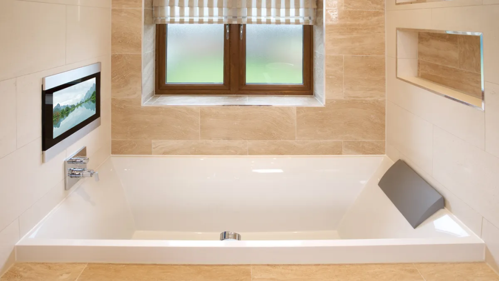
06. Skip This: Maximalist Tech Features
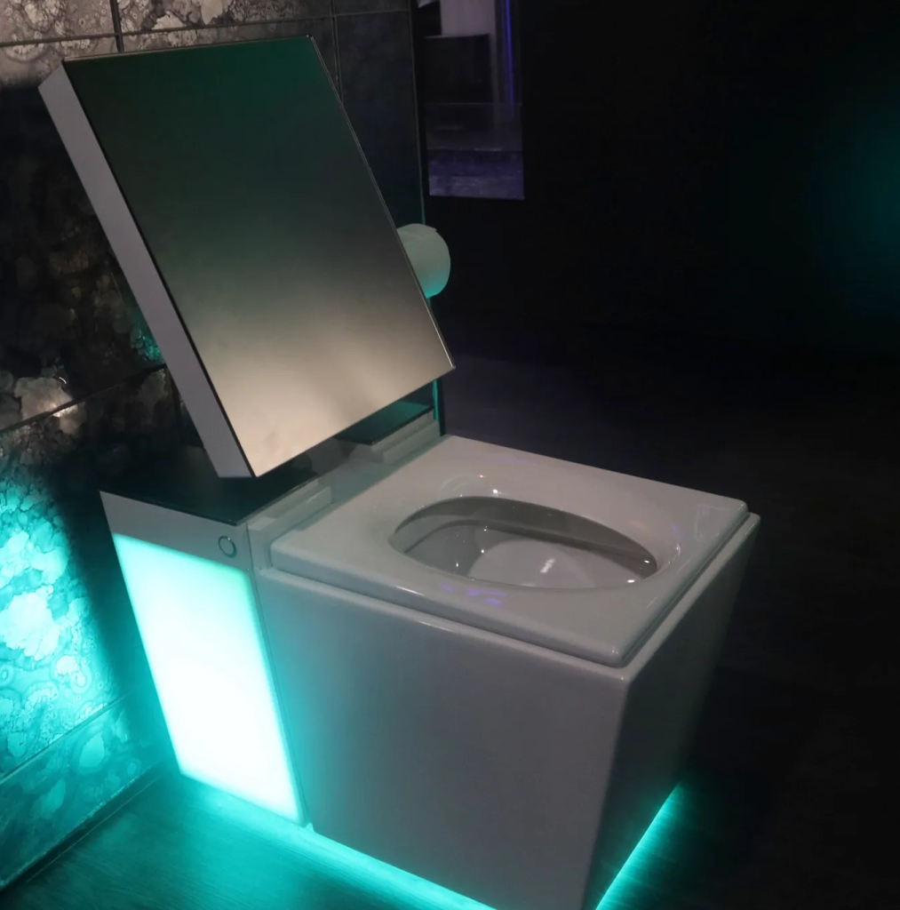
Bluetooth mirrors, built-in TVs behind the bathroom mirror, app-controlled showers with digital displays — high-tech bathrooms seemed like the pinnacle of modern living a few years ago. But the 2026 shift is heading firmly in the opposite direction. Designers are championing bathrooms as one of the last genuinely screen-free, low-stimulation zones in the home. The focus has moved to sensory experiences — texture, scent, sound (analog sound, like a simple waterproof speaker for podcasts, not a built-in TV), and soft, warm light — rather than connectivity.
“We actively design bathrooms as tech-free zones. Our homes should be a retreat from the noise of the outside world.”
— Juliette Byrne, Interior Designer
Why It’s Out: Screen fatigue is real. The last thing most people want while soaking in a tub is another screen to clean, update, or malfunction. These features also date quickly — a “smart mirror” from 2020 already looks and feels obsolete.
Skip: Wall-mounted TVs, smart mirrors with built-in visible screens, app-controlled showers that require a phone to operate, voice-activated everything.
Instead: Spa-inspired details that engage the senses without a login:
- A teak stool or a cushioned bench for seating and towel placement.
- High-quality, heavyweight cotton or linen towels in earthy tones.
- A small tray for candles, a matchbox, and a smooth stone for resting a watch or ring.
- A simple eucalyptus bundle hung from the showerhead for natural fragrance.
- A waterproof speaker for music or a podcast — but no screens.
The goal is to lower your heart rate, not raise it with another notification.
07. Skip This: Coldly Minimalist “Showroom” Spaces
Minimalism done without warmth — without texture, without softness, without a single organic shape — has produced a wave of bathrooms that feel impressive in photos and deeply uncomfortable in person. Think high-contrast black hexagon tiles against stark white subway tile, chrome fixtures, zero textiles, and a single sculptural but hard-edged chair. These combinations look striking in a showroom but fail miserably as places you actually want to spend time. They punish the body (cold floors, hard surfaces everywhere) and offer nothing to the psyche.
Why It’s Out: A bathroom is a wet, humid, highly physical space. It should feel forgiving, not precious. “Showroom minimalism” prioritizes photography over human comfort, and consumers are finally rejecting it.
Skip: Stripped-back spaces with no texture, no warmth, no softness, and no visual relief — all concept, no comfort. Matte black against stark white, chrome on polished tile, zero organic shapes.
Instead: Layered minimalism — a warm, edited approach that uses fewer things but richer materials:
- Natural stone (honed or leathered finish, not polished) on a vanity top or feature wall.
- Fluted wood accents on a vanity front or a niche surround — adds vertical texture and warmth.
- Plaster walls (real Venetian or lime plaster, not textured paint) for soft, matte, luminous depth.
- One or two textile moments: a linen curtain, a cotton runner, a thick wool bathmat.
- An organic shape: a rounded mirror, a curved vanity, a free-standing tub with soft edges.
The best 2026 bathroom isn’t empty — it’s edited. Every material is chosen for its tactile and emotional qualities, not just its visual impact.
The Bottom Line for 2026: Comfort Over Concept
The throughline connecting every trend on this list is the same: bathrooms should feel like retreats, not showrooms. Cold, high-contrast, tech-heavy, and overly sterile spaces are giving way to rooms built around warmth, texture, and genuine sensory calm.
Ask yourself these three questions before any bathroom decision in 2026:
- Does this material feel good to touch? (If it’s cold, glossy, and hard, reconsider.)
- Does this lighting make me look and feel better? (Harsh overheads are out; warm, layered light is in.)
- Would I want to be in this room without my phone? (If the answer is no, you’ve over-teched or under-warmed the space.)
The best bathroom in 2026 isn’t the one that makes the biggest statement or photographs best for Instagram. It’s the one you never want to leave — the room where you linger an extra five minutes simply because it feels like a balm. That’s the new luxury.
| Trend to Avoid | Why It’s Out | What to Do Instead |
|---|---|---|
| All-White Everything | Feels sterile and clinical, not serene | Warm earth tones (clay, sand, taupe) with natural stone accents |
| Millennial Gray & Cool Schemes | Flat, one-dimensional, unflattering to skin | Warm greiges, sage, olive; aged brass hardware |
| Glossy Tiles Everywhere | Slippery, visually noisy, high-maintenance | Matte, eggshell, or handmade zellige tiles with variation |
| Harsh Single-Source Lighting | Creates shadows, no evening mood, unforgiving | Layered ambient, task, and accent lighting at 2700-3000K |
| Chrome Everywhere | Dated “builder basic” look with no character | Brushed brass, unlacquered bronze, or matte black with intention |
| Maximalist Tech | Screen fatigue; features date quickly | Spa details: quality towels, candles, natural fragrance, no screens |
| Cold “Showroom” Minimalism | Impersonal, uncomfortable, punishing materials | Layered natural materials: stone, fluted wood, plaster, soft textiles |