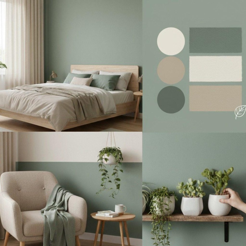
Sage green pairs with almost everything, and there’s a real reason for it: sage is a green with a heavy grey base. That grey content mutes the colour, pushing it toward neutral territory — which means sage behaves less like a colour and more like a sophisticated neutral that happens to be green. It won’t fight other colours the way a saturated emerald or lime would.
But “goes with everything” isn’t a plan. Some pairings make sage feel warm and farmhouse, some make it crisp and modern, and a couple make it genuinely dramatic. Here are the twelve that work — and the colour logic behind each one.
1. Warm White and Cream
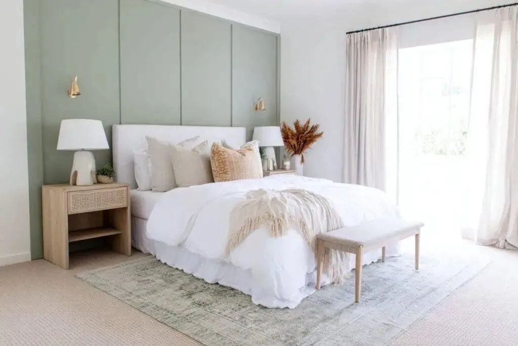
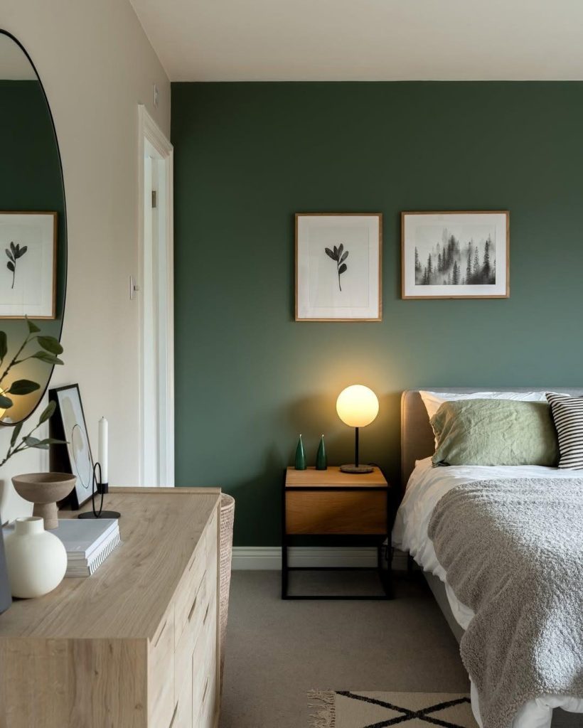
The classic pairing, and the one to default to when in doubt. Warm whites and creams share sage’s soft, low-saturation character, so nothing competes — the green reads as gentle structure against a calm backdrop. A sage panelled feature wall behind a cream-dressed bed is the textbook version. The why: cream contains a touch of yellow, and yellow sits next to green on the colour wheel, so the two relate naturally instead of clashing. Avoid stark blue-whites, which make sage look dingy by comparison.
2. Oatmeal, Linen, and Greige
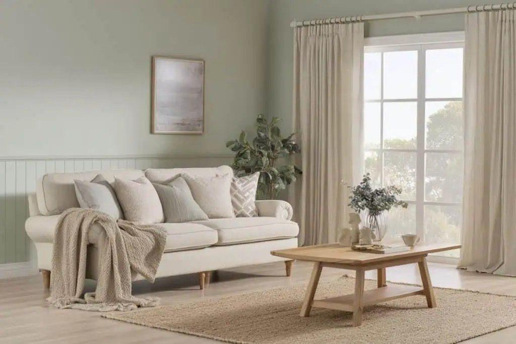
One step deeper than cream: the oatmeal-linen-greige family. These barely-there beiges are sage’s closest tonal relatives — both are muted, grey-softened colours of similar lightness, so a room of sage walls, oat curtains, and a flax sofa feels like one continuous exhale. This is the palette behind the entire “quiet luxury” living room. The risk is flatness; fix it with texture — jute, bouclé, linen weave — rather than more colour.
3. Taupe and Mushroom
Taupe is grey warmed with brown, and since sage is green softened with grey, the two share DNA. Taupe headboards, mushroom throws, and stone-coloured armchairs against sage walls create depth without contrast — the sophisticated cousin of a beige scheme. Designers reach for this pairing when a client says “calm but not boring.” Keep one near-white element in the room (bedding, ceiling, trim) so the muted tones have something to register against.
4. Light Oak and Natural Wood
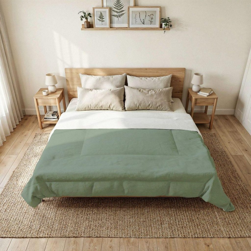
Sage and pale wood is the foundation of every Scandinavian and japandi scheme for a reason: it’s the colour combination of nature itself — foliage and timber. Light oak’s golden undertone warms sage up, and sage returns the favour by making raw wood look intentional rather than unfinished. Oak bed frames, rattan nightstands, and a jute rug under a sage duvet is about as fail-safe as decorating gets.
5. Rich Walnut and Dark Wood
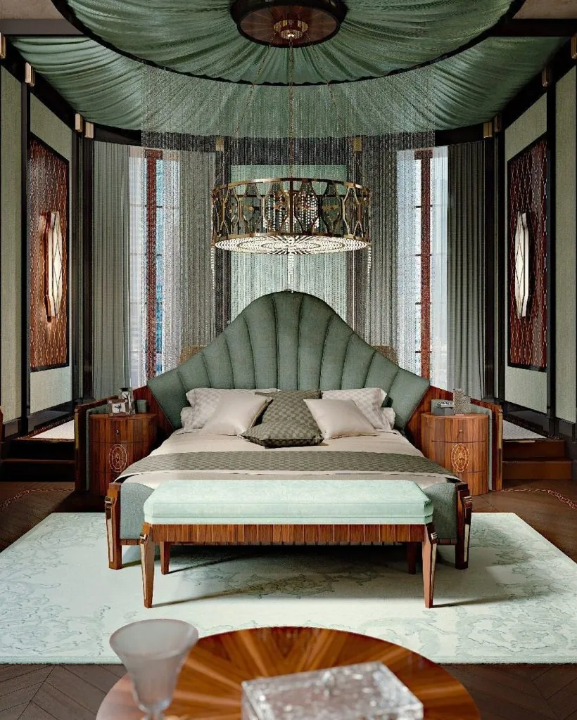
Take the same wood logic and turn the volume up. Deep walnut, rosewood, and mahogany give sage instant glamour — this is the pairing behind every Art Deco revival room, where seafoam-sage upholstery meets high-gloss dark veneer and brass. The dark red-brown of walnut sits near red on the colour wheel, opposite green, so it functions as a softened complementary: maximum richness, no clash. If light oak makes sage casual, walnut makes it formal.
6. Blush Pink
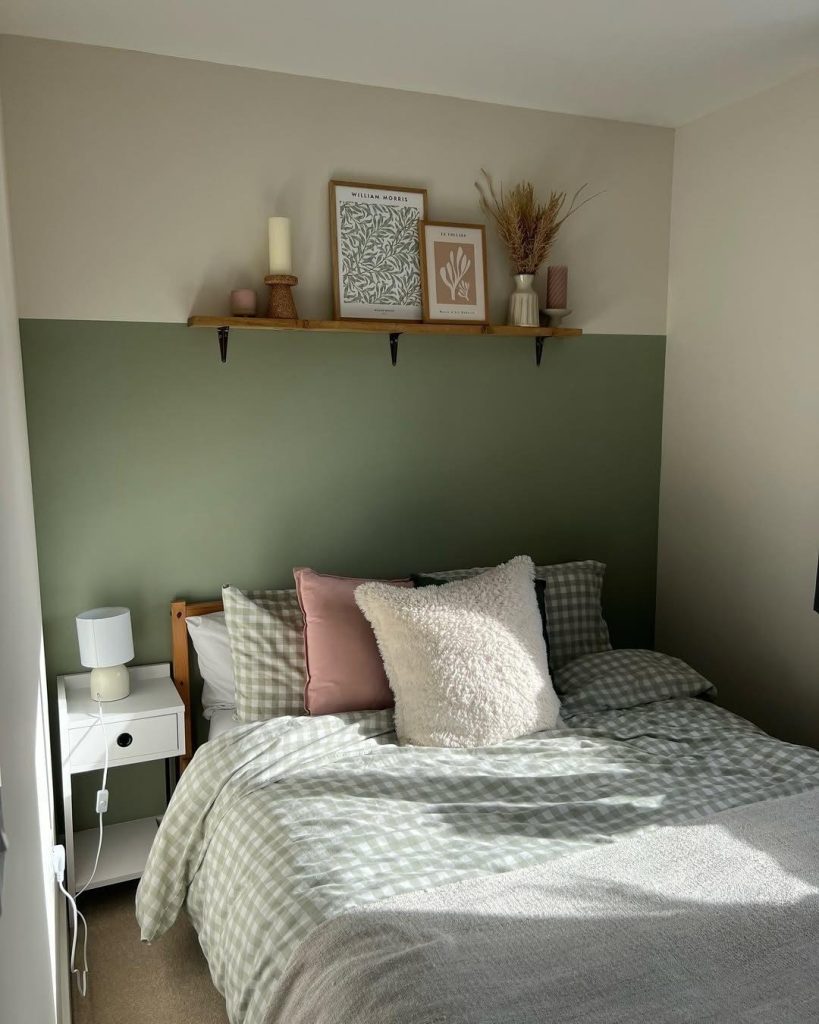
Pink and green is a complementary pairing — red and green sit opposite each other on the wheel, and blush is just red with the saturation drained out. Because both blush and sage are heavily muted, the complementary tension reads as charm instead of contrast. A dusty pink cushion on sage gingham bedding, or blush towels in a sage bathroom, is the cheapest way to make the green feel fresh. Keep the pink dusty; bright bubblegum tips the room into nursery territory.
7. Terracotta and Rust
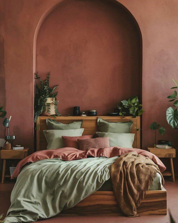
The boldest pairing on the list and the most rewarding. Terracotta is orange-red earth — very close to sage’s true complement — but both colours are muted and natural, so the result is Mediterranean warmth rather than visual noise. A rust limewashed wall with sage bedding, or sage furniture over a terracotta checkerboard floor, delivers more personality than any other combination here.
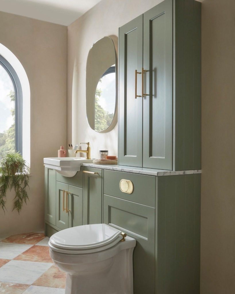
The floor version is worth singling out: terracotta-and-stone checkerboard tiles under sage cabinetry, tied together with brass hardware, is one of the defining bathroom looks of the moment.
8. Deep Forest Green
Tone-on-tone is the designer move: pair sage with its darker siblings — forest, olive, pine. Because they’re the same hue at different depths, the scheme can’t clash; it just gains dimension. A deep green feature wall with a sage linen pillow and oak furniture reads layered and deliberate, like a forest at different distances. This is also the easiest way to make sage feel moody and grown-up without leaving the green family.
9. Matte Black
Black isn’t a colour pairing so much as punctuation. Against grey-leaning sage cabinetry, matte black taps, handles, and mirror frames supply the sharp edges the soft green lacks — the contrast that stops a muted room from going mushy. The rule is restraint: black works as thin lines and small hardware, not big blocks. One black element per surface zone is plenty.
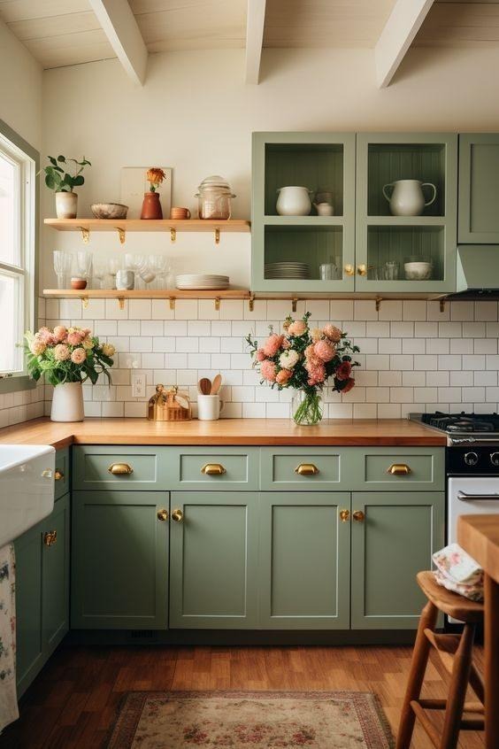
10. Aged Brass and Gold
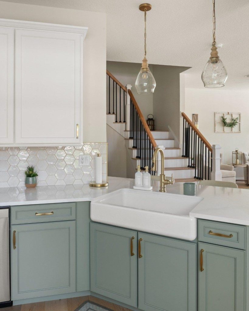
Green and gold is one of the oldest luxury pairings in interiors, and sage is no exception. Brass cup pulls on sage kitchen cabinets, a gold tap over a farmhouse sink, brass cabinet hinges — the warm metal picks up the yellow undertone hiding inside most sages and makes the whole scheme glow.
It scales from a single brass handle to a full set of taps, rails, and pendants — and unlike chrome, brass keeps the room warm. If you only make one hardware decision in a sage kitchen or bathroom, make it this one.
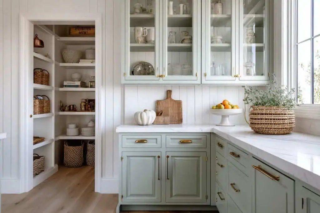
11. Crisp White
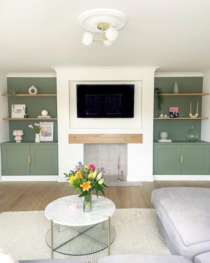
Cream relaxes sage; pure white sharpens it. White walls and trim around sage built-ins, or white subway tile above sage cabinets, gives the green clean modern definition — this is the combination for alcove shelving, media walls, and kitchens that need to stay bright.
White also acts as the spacer that lets sage take more of the room: with white walls and ceiling doing the lifting, you can run sage across every cabinet face without the space closing in.
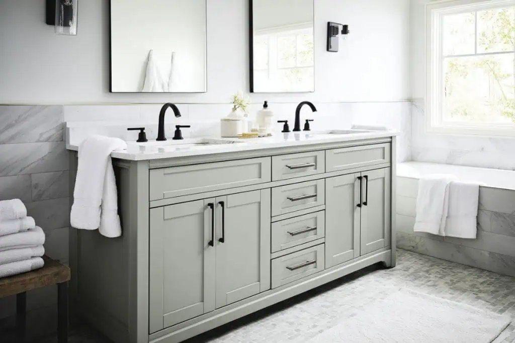
12. Soft Grey and Natural Stone
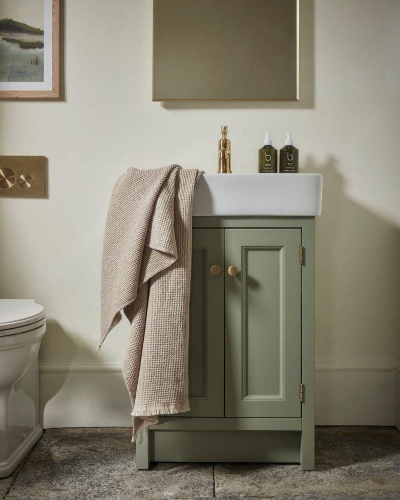
Sage already contains grey, so grey stone, slate floors, and marble-look surfaces slide alongside it without effort — the pairing for spa bathrooms and utility spaces that need to feel calm and practical. A sage vanity on a tumbled grey stone floor, warmed with one brass accent, is quietly one of the most timeless bathrooms you can build. Lean toward warm greys; a cold blue-grey next to sage can drag the whole room toward gloom.
How to Combine Them
Don’t pick one — pick three and weight them. The 60-30-10 rule does the heavy lifting: sage (or a neutral) at 60 percent, a second colour from this list at 30, and an accent at 10. Sage walls, oatmeal textiles, brass hardware. Cream walls, sage cabinetry, terracotta floor. White room, sage built-ins, blush accents. Every combination above slots into that formula.
Undertones decide everything at the margins, so test your exact sage against your exact pairing in the actual room light before committing — and if the sage is going on woodwork or cabinetry, choose a finish that can take the traffic. Our rundown of paint finish choices for high-traffic areas covers which sheens hold up on cabinets and trim, the guide to painting your bathroom handles the steam factor, and if you’re clear-coating a sage-painted vanity or dresser, the guide to water-based finishes explains how to protect the paint without yellowing it.
Planning a full sage kitchen? Before you order cabinets, read the 8 kitchen design mistakes designers see every time — colour is the easy part; layout is where renovations go wrong.