The all-white kitchen—once the undisputed crown jewel of home design—is officially stepping aside. After nearly a decade of dominance, stark white and cool gray cabinets are being replaced by something far more inviting: warmth, personality, and a deep connection to nature. According to Houzz’s 2026 Kitchen Trends Study, wood cabinetry has overtaken white as the top choice for the first time in recent years, with 29% of renovating homeowners selecting wood tones compared to 28% choosing white . This marks a seismic shift in how we think about the heart of the home.
Designers agree: 2026 is the year of “understated confidence” . Homeowners are moving away from sterile showroom aesthetics and embracing kitchens that feel grounded, cozy, and deeply personal . Whether through warm neutrals, rich earth tones, or unexpected pops of color, the trend is clear—kitchens are no longer just functional spaces; they’re emotional sanctuaries. Here are 13 cabinet color ideas defining this new era.
Key Considerations Before Choosing Your Cabinet Color
Cabinet Finish Matters
The finish you choose dramatically affects how your color reads. Matte and eggshell finishes are trending for their ability to absorb light and create a soft, sophisticated look. Higher sheens work well on darker colors to bounce light and add dimension. Satin finishes offer a balance between durability and aesthetic appeal, making them popular for busy kitchens.
Lighting Impacts Color Perception
Natural and artificial lighting can dramatically change how a cabinet color appears throughout the day. Test samples on your actual cabinets and observe them at different times—morning, noon, and evening. North-facing rooms benefit from warmer tones to compensate for cooler light, while south-facing rooms can handle deeper, moodier shades.
Countertop and Backsplash Coordination
Your cabinet color should harmonize with your countertops and backsplash. Warm wood pairs beautifully with natural stone and quartz. Dark cabinets need lighter countertops to prevent heaviness. Neutral cabinets offer maximum flexibility for bolder surfaces. Always bring samples together before committing.
Hardware and Accessories Complete the Look
The right hardware can elevate your cabinet color. Warm brass complements earthy tones and greens. Brushed nickel and chrome work well with cool blues and grays. Black hardware adds contrast to lighter cabinets. Matte black is particularly trendy for 2026, offering a modern edge.
Open-Plan Considerations
In open-plan homes, your kitchen cabinet color should coordinate with adjoining living and dining spaces. Consider the overall flow and ensure colors transition smoothly. Islands can serve as a transition piece, carrying the color story between zones.
Resale Value vs. Personal Expression
While bold colors express personality, consider your long-term plans. Neutral cabinets generally have broader appeal for resale. However, designers note that today’s homeowners are prioritizing personal enjoyment over resale value. If you love a color, it’s worth investing in—you can always refresh with paint later.
Longevity and Timelessness
Trends evolve, but some colors have enduring appeal. Natural wood, warm neutrals, and classic navy have proven staying power. If you’re concerned about longevity, incorporate bold colors on islands or lower cabinets where changes are easier and more affordable.
1. Natural Wood Tones (The Comeback King)
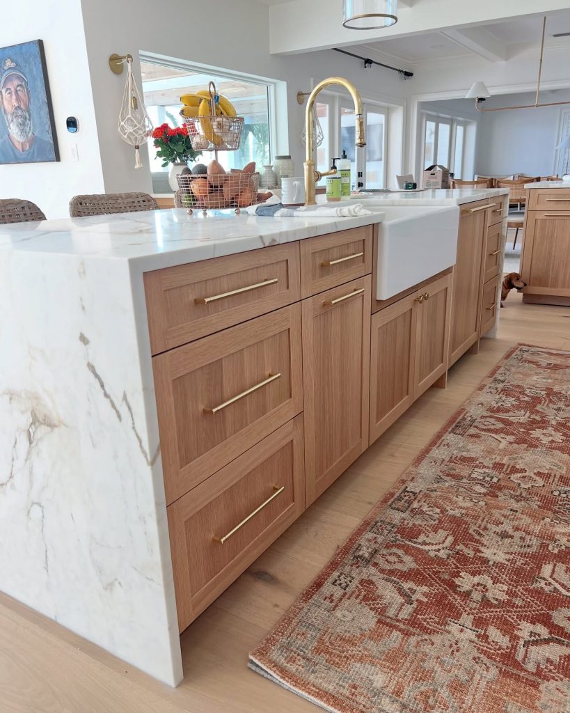
Wood has officially reclaimed its throne. Light to medium stains in oak, walnut, and hickory are leading the charge, offering warmth and texture that painted finishes simply cannot replicate . Designers note this isn’t the heavy orange-toned oak of the ’90s—today’s woods feature lighter lacquers that celebrate grain and movement .
Pro tip: Pair with warm brass hardware and natural stone countertops for a modern, sophisticated look.
2. Warm Neutrals (Cashmere, Taupe, and Greige)
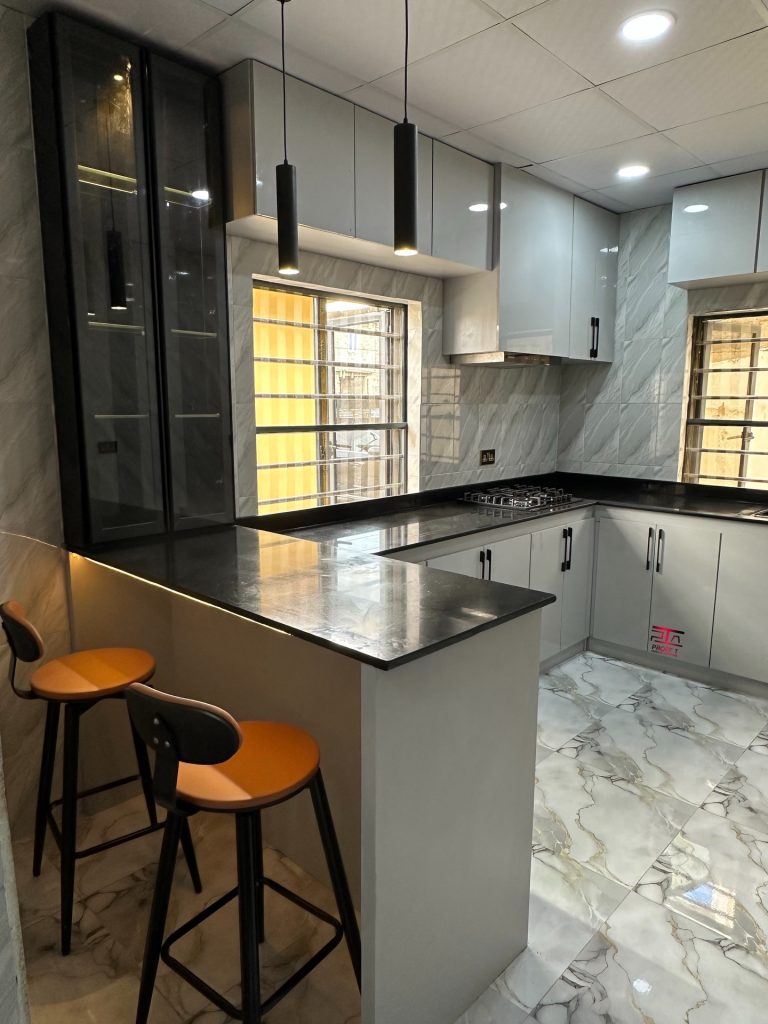
Stark whites and cool grays are out; their warmer, more inviting cousins are in. Think “cashmere kitchens”—layered neutrals like mushroom grays, soft taupes, creamy putty, and earthy sands that exude traditional elegance . These shades create serene backdrops that enhance tactile quality and architectural details .
Pro tip: Use these as a foundation and layer in natural wood or textured accents for depth.
3. Sage and Muted Greens
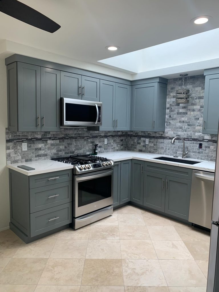
Green remains a powerhouse in 2026, but the preference has shifted toward muted, silvered, and nature-inspired shades . Sage, olive, moss, and pistachio offer a soothing balance between color and neutrality, bringing “calm sophistication” to the kitchen .
Pro tip: Pair with warm brass hardware, light oak accents, or crisp white marble for a fresh, sophisticated feel .
4. Deep Moody Greens
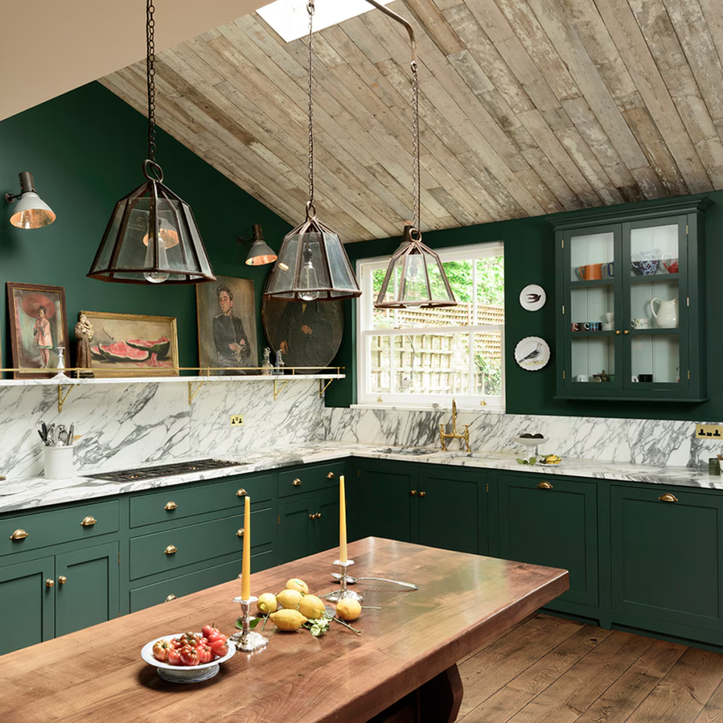
For those seeking drama, dark forest greens and near-black greens are having a major moment . These shades add depth and sophistication while still feeling cozy and intimate when balanced with warmth . As one designer notes, green “bridges tradition and modernity” .
Pro tip: Balance with warm wood tones and natural textures to prevent the space from feeling heavy.
5. Butter Yellow
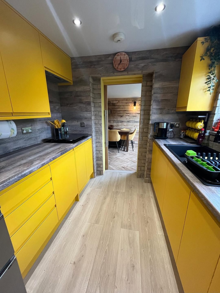
This cheerful yet grounded hue is emerging as a surprising trend for 2026 . Butter yellow—muted and creamy rather than bright—adds warmth without being cloying. It performs especially well in darker kitchens where white would look cold .
Pro tip: Use as a statement on an island or pantry, or pair with soft grey for a cheerful modern combination .
6. Expressive Plum and Burgundy
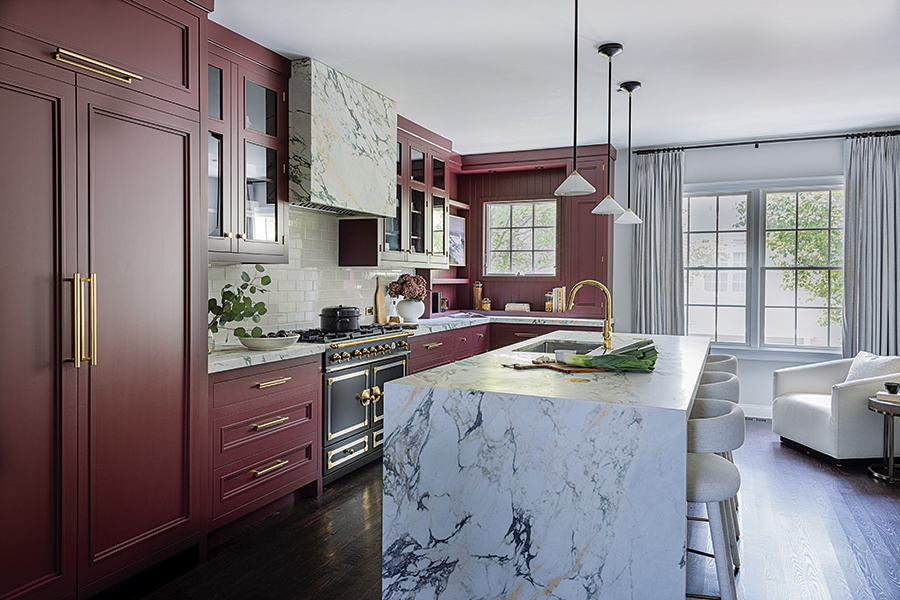
Purple is “the new kitchen blue” according to designers, with plums, burgundies, and deep purples making bold statements . These rich, grounded colors add unexpected personality and work beautifully on islands or bar cabinetry .
Pro tip: Keep backsplashes minimal to avoid competing with these dramatic hues.
7. Navy and Dusty Blue
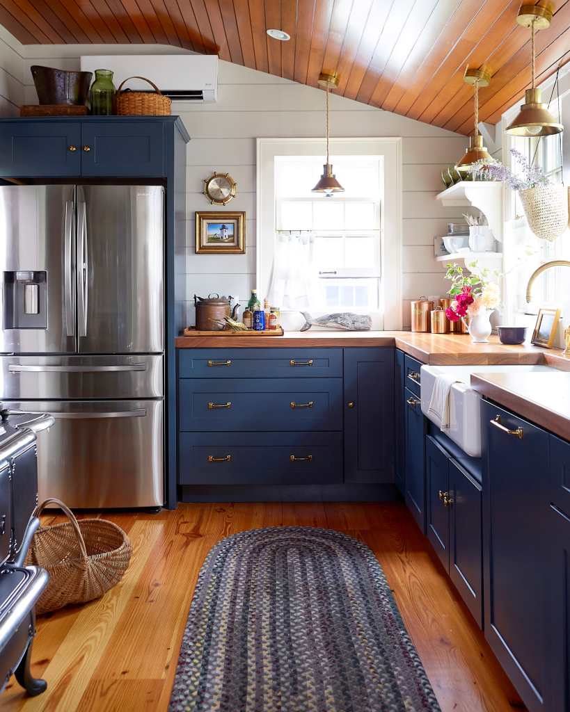
Blue has surged in popularity—according to Houzz, it increased by 18% year-over-year . Navy and muted dusty blues offer versatility, pairing harmoniously with both warm and cool palettes . Blue’s association with stability and calm makes it a strong option that transcends trends .
Pro tip: Use darker blues on lower cabinets or islands to create visual anchors in open-plan kitchens.
8. “Muddy” Pastels
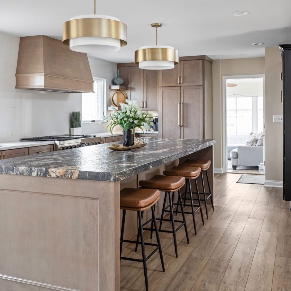
Designers are embracing what they call “muddy hues”—soft pastels with a dusty, imperfect quality . Shades like Farrow & Ball’s Dead Salmon, Hay, and Borrowed Light feel bold yet storied, adding warmth that juxtaposes functionality . These tones work especially well in older homes but add character to new builds too.
Pro tip: These slightly “grimy” tones feel right in spaces with history—use them for a collected-over-time look.
9. Charcoal and Near-Black
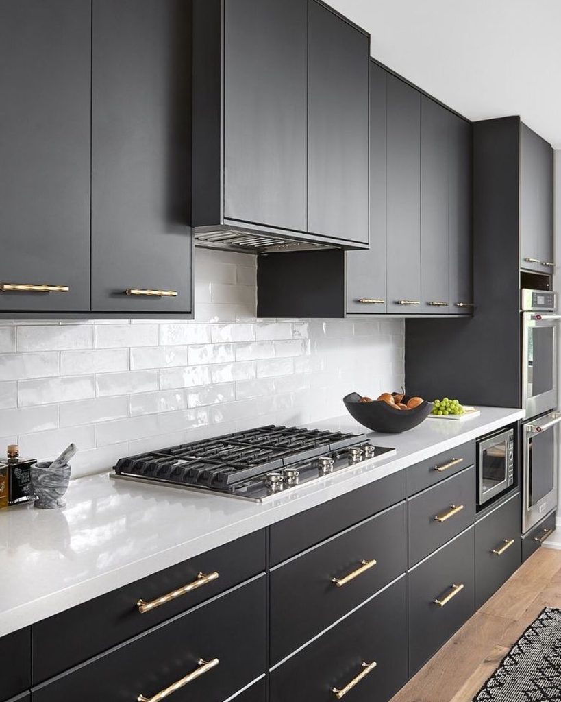
While all-black cabinets are declining, sophisticated charcoals and near-black shades are rising . These colors provide dramatic contrast without reading as stark or cold. When balanced with warmth, they feel inviting rather than heavy .
Pro tip: Higher sheen finishes on darker cabinets help bounce light and add dimension .
10. Warm Browns and Clay-Inspired Tones
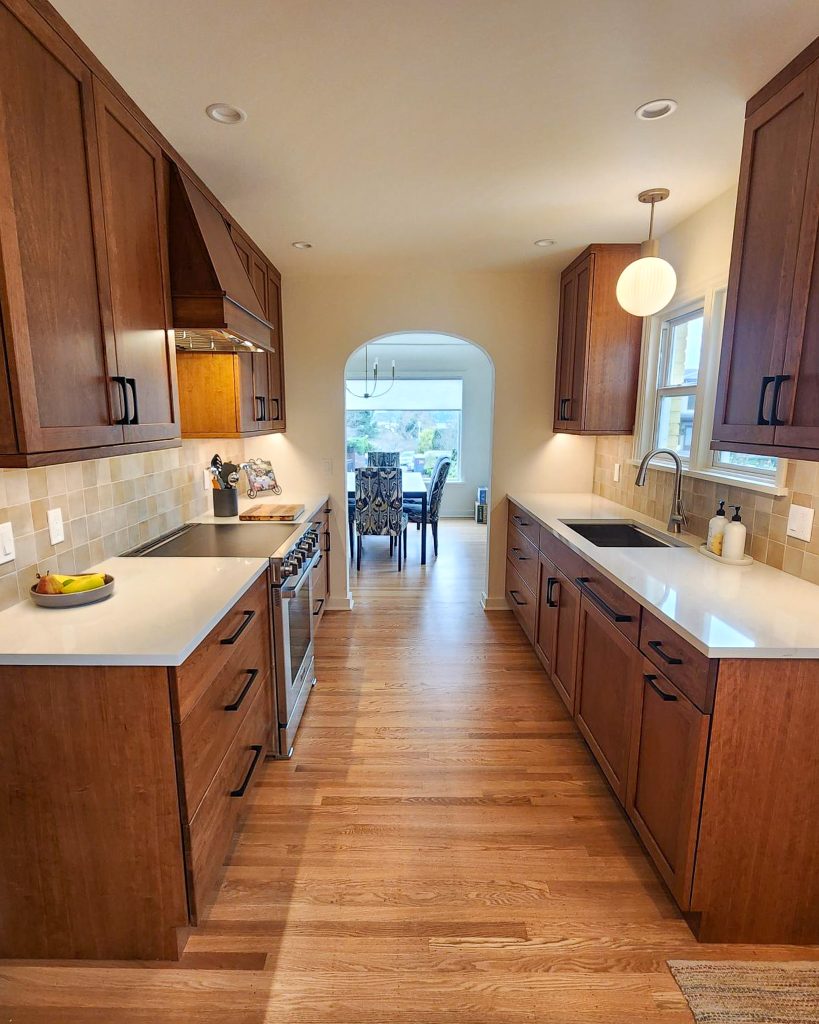
Earth-forward hues like terracotta, rust, cinnamon brown, and soft umber are gaining traction . These colors bring comfort and character, pairing beautifully with neutral walls or natural wood accents . They’re bold enough to make an impact while still feeling warm and approachable.
Pro tip: These work wonderfully in rustic or earthy kitchen designs.
11. Cream and Off-White (The New White)
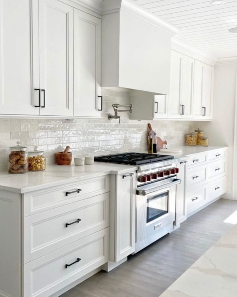
If you still crave a light palette, cream and off-white have replaced stark white as the go-to choice . These warm whites keep kitchens bright and open while avoiding the clinical feel of pure white. Off-white now accounts for 15% of renovations .
Pro tip: Pair with brass hardware and textured stone countertops for warmth and elegance.
12. Two-Tone Combinations
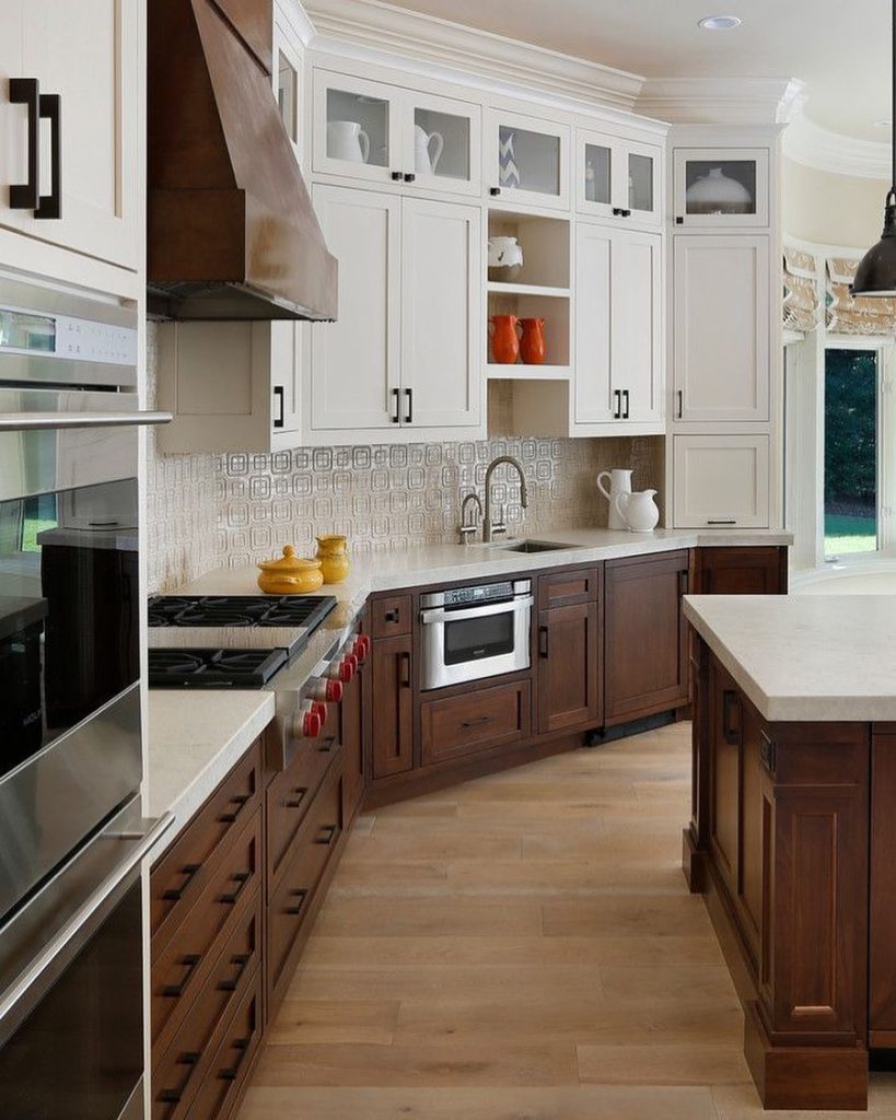
Nearly one-quarter of homeowners now opt for contrasting upper and lower cabinets . Popular combinations include light uppers with darker bases, wood lowers with painted uppers, or a dark island paired with lighter perimeter cabinets . This approach adds visual interest without overwhelming the space.
Pro tip: Try sage green uppers with warm wood lowers for a nature-inspired pairing.
13. Tone-on-Tone
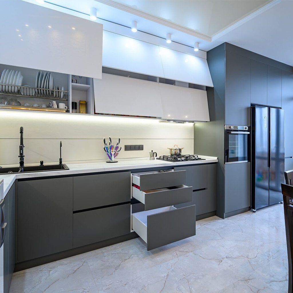
A subtler evolution of two-tone, this trend uses two shades of the same color to create depth and interest . Using two close greens or two taupes adds richness that’s almost imperceptible at first glance but transforms the space.
Pro tip: This technique makes a room look effortlessly sophisticated and curated.
Maintenance and Practicality Tips
Color and Concealment
Lighter cabinets show less wear on flat surfaces but reveal every smudge around handles and frequently touched areas. Darker cabinets hide daily dust but show fingerprints and water spots more prominently. Matte finishes conceal imperfections better than high-gloss. Consider your lifestyle—families with young children may prefer forgiving matte finishes in medium tones.
Cleaning Considerations
Different colors require different cleaning approaches. White and light cabinets need regular wiping to prevent visible grime buildup. Dark cabinets benefit from streak-free cleaners to avoid residue. Wood cabinets require specific wood-safe products to maintain their finish without damage.
Durability of Finishes
Painted cabinets, especially in darker shades, may show chips and scratches more visibly. Glazed finishes offer additional protection. Factory-finished cabinets generally outperform on-site painting in durability. Consider your kitchen’s usage level when selecting both color and finish.
Budget and Implementation Guide
Cost Variations by Color and Finish
Custom colors and specialty finishes typically cost more than standard offerings. Premium paint brands with richer pigments come at a premium. Wood stains vary significantly in price based on wood species and complexity. Two-tone and tone-on-tone designs often involve higher labor costs.
Painting Existing Cabinets vs. Full Replacement
Painting existing cabinets is significantly more affordable than full replacement—often 50-70% less. However, not all cabinets are suitable for repainting. Laminate and thermofoil cabinets may not accept paint well. Wood cabinets with minimal damage are ideal candidates. Professional painting ensures lasting results.
Refacing as a Middle Option
Cabinet refacing—replacing doors and drawer fronts while keeping the cabinet boxes—offers a middle ground. This option provides a completely new look at 40-60% of replacement cost. It’s particularly effective for color changes since new doors can be finished in any shade.
DIY vs. Professional Installation
While DIY painting can save money, professional results are worth the investment for kitchen cabinets. Professionals ensure proper preparation, priming, and finishing that withstand daily use. For wood stains, professional application is strongly recommended to achieve even, lasting results.
Expert Designer Insights
What Designers Are Saying
Industry leaders agree: warmth and personality are the driving forces of 2026 kitchen design. Designers emphasize that today’s clients are “stepping away from all-white and craving warmth, color, and personality.” The shift reflects a broader cultural move toward authenticity and comfort in home design.
Common Mistakes to Avoid
Experts warn against choosing colors based solely on trends without considering your home’s architecture and natural light. Testing samples in your actual space is non-negotiable. Another common error is neglecting to coordinate cabinet colors with fixed elements like flooring and countertops. Don’t forget to consider how hardware, lighting, and accessories will interact with your chosen color.
Designer Predictions Beyond 2026
The trend toward warmth and personal expression appears sustainable. Designers predict continued interest in natural materials, earthy tones, and colors that evoke emotional connection. The pendulum is unlikely to swing back to stark minimalism anytime soon.
Regional and Global Influences
European and Scandinavian Inspirations
European design continues to influence kitchen trends, with Danish and Swedish aesthetics emphasizing light woods, warm neutrals, and functional simplicity. Italian kitchens showcase bolder choices—deep greens, rich plums, and dramatic contrasts—inspiring American homeowners to push boundaries.
American Regional Preferences
Coastal areas lean toward blues and soft greens, reflecting ocean and nature influences. Southwestern regions embrace terracotta, warm browns, and earthy tones. Urban homeowners gravitate toward dramatic charcoals and statement colors. Suburban kitchens often balance trend with timelessness through two-tone approaches.
Global Color Movements
The global shift toward biophilic design—connecting indoor spaces with nature—drives the popularity of greens, browns, and wood tones. This movement transcends borders, making these colors universally appealing across cultures and climates.
Conclusion
The kitchen cabinet trends of 2026 tell a compelling story of evolution—from the clinical, minimalist spaces of the past decade to warm, inviting environments that prioritize personal expression and emotional connection. As designers emphasize, homeowners are seeking kitchens that feel “grounded, cozy, and handcrafted” . This shift manifests through the resurgence of natural wood, the embrace of warm neutrals, and the strategic use of unexpected color.
Whether you’re planning a full renovation or a simple refresh, the message is clear: don’t be afraid to move beyond white. As one designer puts it, “choose anything but white. Embrace depth, mood, and color” . The kitchen of 2026 is a sanctuary—a space that reflects who you are and how you want to live. That’s a trend worth investing in.
